(Archive) Advertising District / Dump-Place
-
 19-April 07
-

 Austin55
Offline
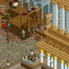
I want to see more of that zip line especcially since it looks operable. And the setting looks intense.
 -

 FredD
Offline
@Xtreme97: looks good, I'd only change those 1K ruins to gray as Ruben already suggested. Look forward to see more!
Shangri-La is reaching completion, probably next week I think. So this is the last screen I'll show. Oh yeah it needs some foliage at some places, don't mind that.
-

 ivo
Offline
Back in 2007 you thought my paths were roofs because I used blocks without a path texture. I think the same thing is happening for you now haha. It differs very little from the ground texture. Try a more texturize path.
---
This map has secretly reached about 80% of completion. I probally start an ad topic next month.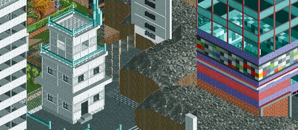
-

 FredD
Offline
Adding peeps is always the last thing I do, atm there isn't even path. Also have to do that yet.
 -

 Louis!
Offline
Fred, it feels like that screen is screaming out for something, foliage would add to it immensely and I think the peach brick is odd. Also, the flanges would look better the same colour as the main support.
Ivo, that's lovely. The textures and colours work really well. Great composition. -

 dr dirt
Offline
what you've been building makes no sense ivo.. how that last park you made won a medal is beyond me. I hope you go back to building with a little context again.
 -

 Ruben
Offline
@Fred: Lovely stuff, but one thing réálly bothered me. You did a sloppy job on the 1k ruins, something a lot of people (sadly) do. A lot of them are placed in the same angle, making it look very fake and sterile, and you've hardly used any others than the 1/4th tile ones. If you'd switched angles in a logical sense, and varied more in the ruin size you used it would've looked a lót more natural. Right now it ruins (no pun intended) part of the atmosphere, which is a sad thing, 'cause the rest looks great.
@Ivo: I quite like it. Maybe a bit tóó rough around the edges, and lacking a base lvl of context like dr dirt said. Feels like it'd work better if you'd placed this in a wacky though senseful setting like you guys did with the kim jong il park. Think of the possibilities! The very first inhabited moon settlement, A steampunk parralel universe, IKEA-land, you name it! (You're probably a lot better at coming up with wacky themes than I am anyway, always been terrible at that non-realistic stuff.) -
 Goliath123
Offline
theres to many flanges on those supports fred, and i dont really think changing the tracks colour in the splashdown is realistic
 -

 Midnight Aurora
Offline
It's an outstanding idea, Xtreme. I hope it turns out as amazing as the ride yours inspired me to dream up in my head.
 -

 Ling
Offline
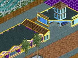
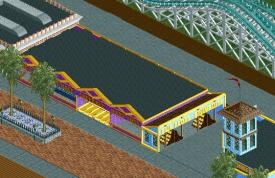
I would like to see a little more variation on the facade on the purple building. Either color changes, elevation changes in the roof, or texture changes. It's good as a whole, just a little bland.
 -

 imawesome1124
Offline
If this comes together the way I see it in my head, it will look a lot better as a completed area, but will seem bland until I get to that point. I also feel like noting that this is my first serious attempt at the game and my first time ever using 8cars.
 -

 Austin55
Offline
Good stuff for first attempts. I see the building on the left off screen has some vents and stuff, the other buildings could benefit from those.
 -

 Mr. Coaster
Offline
imawesome - looks nice, though the small tower on the blue building seems to serve no purpose and i think that the blue and white coaster colors are a bit odd for a wooden coaster.
wheres_walto - nope! apparently not
 Tags
Tags
- No Tags
