(Archive) Advertising District / Dump-Place
-
 19-April 07
-

 ivo
Offline
I am to excited to not show anything so here are some screens of stuff that wasn't good enough.
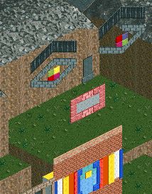
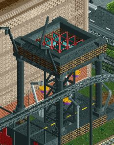
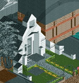
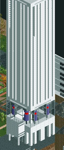
-

 Ling
Offline
Thank you ivo. This thread needed real content.
As always, your shit makes no sense and I don't like it, but it's extremely interesting. -

 ivo
Offline
First you thank me for real content and then you tell it makes no sense. tssss
I can understand that you don't understand it though. I am hoping the actual content in a different context does makes sense. -
 Luketh
Offline
I'mma have to agree with RMM and Ling. Foolish of me for posting screenshots in the dump place. RMM summed it up quite nicely earlier today:
Luketh
Offline
I'mma have to agree with RMM and Ling. Foolish of me for posting screenshots in the dump place. RMM summed it up quite nicely earlier today:how dare you guys. posting random screens.
this is the dump-place, pride and soul of NE.
Anyways, I like your work, ivo. You play RCT like it's a blank canvas and you're an abstract artist. I can't say that those screens make much sense, but they're interesting, indeed. I quite like the churchish building in the third screen. -

 SchwarzRozen
Offline
I think it looks fine ivo by judging it as an abstract concept that is. I'm a fan of the tall building on the last screen for sures ^,^
 -

 Casimir
Offline
Kind of unrelated to RCT, but I played around with Chunky (renderer for Minecraft) on my Disney Castle

-

 SchwarzRozen
Offline
At first I thought it was RCT3, but its Minecraft! You plan on releasing that save data?
 -

 Ling
Offline
Way too many textures MCI, but it's very interesting overall, and has a curious atmosphere. I'm not really sure what it's supposed to be beyond slightly western industrial. I feel as though some of the supports on the invert's lift hill could be closer to either the track or catwalk.
 -
 Loopy
Offline
Out of interest, does anybody still have a copy of RCTGL they could upload? Would be interesting to take a look at some of the more recent parks rendered in 3D.
 -

 FredD
Offline
Don't mind the area behind the coaster and buildings, that is one of the last things to be finished. Supporting needs also to be done yet.
-

 Ruben
Offline
Wow.
Fred, you just upped your game bigtime. Some of the best, cleanest stuff I've seen on this site for quite a while. Love it. The colors, the textures, all.
Just óne nitpicky detail: The two bridges in the middle are okay, but I think it'd be way cooler if you'd make it one bigger bridge. Now the scale is kinda off compared to the rest of the structure.
But once again, being nitpicky, this is just wow and I'm looking forward to seeing this finished. -

 trav
Offline
Hi my name is FredD and welcome to ROOF: The ride.
Overall it's not too bad, I don't agree that it's some of the best stuff seen on the site recently, I much prefer your Plopsa park for a start. There isn't really anything that jumps out and grabs my attention, it's just sort of all 'there'. I think you could make the roof a lot more interesting, and use less colours on the roofing - Peach+red+brown right next to each other just doesn't work for me. I'm also not a fan of the grey in general, it sort of kills any atmosphere for me. I look forward to seeing more though. -

 FredD
Offline
Hi my name is FredD and welcome to ROOF: The ride.
Overall it's not too bad, I don't agree that it's some of the best stuff seen on the site recently, I much prefer your Plopsa park for a start. There isn't really anything that jumps out and grabs my attention, it's just sort of all 'there'. I think you could make the roof a lot more interesting, and use less colours on the roofing - Peach+red+brown right next to each other just doesn't work for me. I'm also not a fan of the grey in general, it sort of kills any atmosphere for me. I look forward to seeing more though.
Funny, but the queue zone of Shambhala has also a lot of roof I'll try to do something about the interestingness of the roof(s) and the colors. I didn't want use brown everywhere because I try to avoid too much brown. But you're right that there are too many roof colors, I'll just stick to peach and brown I guess. The gray just belongs in the theme, I don't agree with your opinion, gray can be atmospheric.
Thanks Ruben, I don't want to make one bridge of those 2 bridges because IRL Shambhala also has 2 bridges.
 Tags
Tags
- No Tags


