(Archive) Advertising District / Dump-Place
-
 19-April 07
-
 Mattk48
Offline
I don't think your screen was that bad, and as far as I'm concerned you can improve greatly on this site through practice and using the constructive critisim people give on your screens
 -
 RCT2day
Offline
SchwarzRozen, really good start for someone new here. I'm looking forward to more pics and seeing what you can do.
 -

 Arjan v l
Offline
Advanced Newbie eh? xD
Yeah, I guess you can say that I've been playing sense 02, but never have been able to grasp the "professorial" look to it, so I've just said "I'm doing it my own way, and just having fun with what I have!" Maybe another site would be better to show my stuff with this kind of attitude, but most of the other sites either suck or are insanely inactive .-.
Well at least I'm not newbie newbie x3
Don't feel offended, everybody new get's the same treatment.
Tyandor is only being sarcastic ,don't let it get to you.
We all started building like that.
It takes time to reach perfection.
Keep going.
-

 gir
Offline
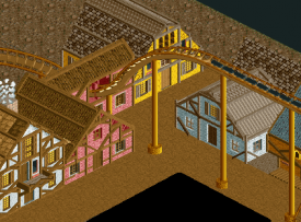
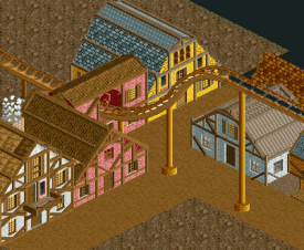
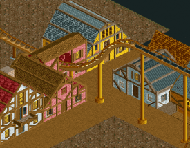
Schwarz, not a bad effort. What I can see of the coaster looks intriguing. The buildings, however, need work. You use too many roof and wall types on the same structure. It's almost as if you're trying to over-complicate the texture of the buildings to compensate for the fact that the form of the buildings is uninteresting. I'd say think of the form of the building first (what will its shape be, how does that shape interact with other buildings, the path, the landscape, etc) and then begin adding layers of detail--windows, wall textures, roof-lines, and so on. In my opinion, it looks like you've tried to do it all at once. I'm not trying to tell you how to play the game, I'm just suggesting that regardless of how you decide to build buildings and layout your park, put some more thought into it.
Also, what's with the fence at the edge of the map? -

 SchwarzRozen
Offline
@Arjan - I'm not trying to reach perfection on this site, just what ever pleases me is fine by what I see ^,^ If I can happen to make eye candy for others, then so be it
@Gir - Buildings, right, gotcha. Textures and walls and over complications, ok O~O
Also, I'm pretty sure I'll "get better" over time, hell right now I'm just messing around in a workbench I made from two years ago! Maybe I'll get "more serious" later, but right now I'm having fun with whatever I'm doing!
Oh yes, and I remember there being a good workbench to use to toy around with thats on this site from like 2006, does anyone happen to have that link, I would like to mess around with some of the custom scenery stuff! ^,^
I'm planning on adding some shrubs and some other things to make it look more pretty (How pretty can a dessert/mine shaft be .-.).
Edit : I found some workbenchs on the site! Never mind about that ^,^ -

 Xtreme97
Offline

Wow, that looks really cool. The buildings look great but I think there may be too much gray path. Perhaps try expanding the crazy paving? Also, the shops underneath the transfer shed seem very strangely placed.
Is this from Fellville? The park is looking amazing so far. -

 Ling
Offline
The large flat roof is very boring, try breaking up the levels a bit. Also, for the fences by the queue, you should angle them where they follow the inclined path, not just plop them down as blocks. It's more work but it looks a lot better. The castle texture does not work here in my opinion, stick to the steel and wood in different variations.
I'm planning on adding some shrubs and some other things to make it look more pretty (How pretty can a dessert/mine shaft be .-.). -
 MikaRCT2
Offline
Thank you Arjan! If you didn't give me color advice that screen wouldn't have the red in it, which makes the screen complete IMO
-

 RCT2day
Offline
Raise the roof one unit up, to avoid lawsuits. But yeah, you are getting a lot better.
 -

 chorkiel
Offline
I'd like to see you experiment more with colors. All your roofs are brown right now.
 -

 chorkiel
Offline
Already better. But I think you can still improve it, you shouldn't get afraid to think out of the box. Use a random color and if it isn't working you can always change it.
 Tags
Tags
- No Tags
