(Archive) Advertising District / Dump-Place
-
 19-April 07
-

 MikaRCT2
Offline
Thank you, I'm building the archy first, and when an "area" is finished I'll add foliage and flowers, because without the flowers it'll be too brown. It's hard to build colorful when having a medieval theme.
 -

 Arjan v l
Offline
Thank you, I'm building the archy first, and when an "area" is finished I'll add foliage and flowers, because without the flowers it'll be too brown. It's hard to build colorful when having a medieval theme.
I know what you mean, different types of green ,brown ,faded red ,grey ,black and white will be the best choice of colours ,i guess.
You can also try to use walls with a colour of their own ,that isn't in the colour palette. -

 MikaRCT2
Offline
Ah thank you for the green, haven't thought about that one
 Another good color is yellow
-

 chorkiel
Offline
Great to see you improve and making progress.
I don't like the door though. For an entrance it seems very uninviting to have a nearly closed door. Maybe put the door next to path, over the dirt. If you get what I mean.
Also, the opening for the coaster is really small. People would bump their head. -

 MikaRCT2
Offline
The door is the exit
 The entrance is on the other side and the queue is a small street with some buildings
And you're right about the opening, I'll fix that ASAP. -

 In:Cities
Offline
Looks great! However, I think it could benefit from being a little larger in a sense. Consider adding a little more onto the building itself in order to include a gift shop leading from the exit. Or maybe a little courtyard area leading into the entrance of the ride. You've got to integrate this in with the surroundings so it will appear believable!:] If this is just going to be a stand-alone building, it will simply appear like it was placed there without much thought.
Just an idea!
You are really becoming great at this game though Mika. Very proud to see how far you have come in such a short time!
-Josh -

 chorkiel
Offline
Then it still wouldn't really make sense when groups of people all have to exit through a nearly closed door. I like the door idea but I'd still put it to the outside.The door is the exit

Your park though. -

 Goliath123
Offline
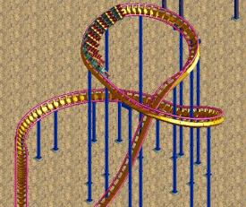
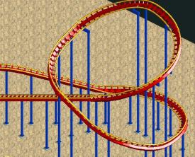
Robbies is in reverse, sham starts with a steep rise then smoothly flattens out
http://www.rcdb.com/10239.htm?p=38609 -
 coasterfreak101
Offline
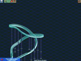
Your first was much better, but not perfect. The entire design of the ampersand revolves around the steep incline through the center and the apex of the turn being located right at the halfway point. You're trying to make one that might be too small to really function like Shambhala's, in that it doesn't show the transition from steep to shallow (and wider to tighter in radius) and back to a steep (and wider again) wraparound.
 -
 ScOtLaNdS_FiNeSt
Offline
I was going to do a design with shambhala and dragon khan about 5 months ago the only reason it didnt progress any further was because of that stupid element. I just couldnt get it to a satisfactory way. Brutal man.
 -

 Austin55
Offline
^That is the ideal but to short, I was aiming for around 110 rct feet.
Scotlands-Dude, a design with those two coasters would be epic if pulled of. They look stunning together. It's a tough element for sure.
 Tags
Tags
- No Tags
