(Archive) Advertising District / Dump-Place
-
 19-April 07
-

 geewhzz
Offline
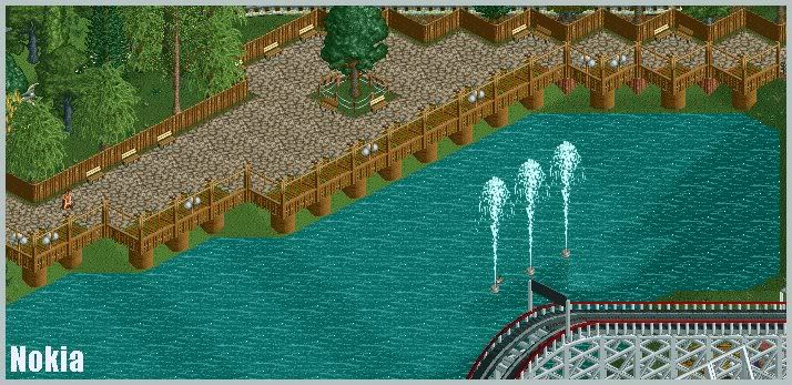
I'm gonna have to agree with gir here. For some reason the screen just isn't doing anything for me. I have grown out of the 1/4th tile queue lines and I no longer think they fit RCT well. The rapids ride looks nice but there isn't too much thought on it. There should be a constant flow of water and it just feels a bit flat here. Maybe if there was some elevation change it could appear more realistic. Also I just dislike how the rapids boat circles around on a flat piece of water with no divider, that just isn't realistic. I just feel it's such a step down from mystery creek. Coming from you I want to like it but I just can't get into it.
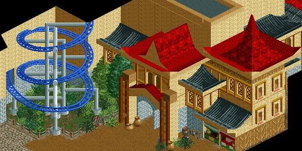
Also is that a vertical lift I see bottom left? -

 Nokia
Offline
nicely done on the supports.
but the blue doesnt really fit in with the rest of the screen though. -

 JDP
Offline
^Actually the supports are wrong. Not that good imo.
Other than that it looks pretty nice. And why didn't you just post this in your own topic?
-JDP -

 geewhzz
Offline
Only thing I can recommend is a launch catwalk, hydraulic building, and some larger low-zone fences.
 -

 ACEfanatic02
Offline
Tell me, what's in those buildings?
'Cause they seem awfully small to be worthwhile.
-ACE
 Tags
Tags
- No Tags


