(Archive) Advertising District / Dump-Place
-
 19-April 07
-

 Liampie
Offline
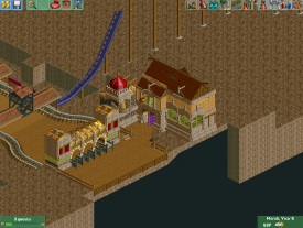
The extended parts look very forced, and I don't like the tower gets thinner at the bottom. Not terrible though.
In general: where are the screens people? The fiesta wasn't that exhausting, was it? -

 Dark_Horse
Offline
CF, that's an awesome screen. As already stated, the path combination isn't bad, but the dirt pieces look like you just placed them haphazardly.
 -

 Pacificoaster
Offline
You're progressing nicely Shotguns, but you are relentless to build at the map's edge.
 -

 FK+Coastermind
Offline
Pac said what i want to say, which seems to always happen! grrr
yeah, ur definitely getting better. this set of buildings shows alot of new skills in detailing, though i'd be careful about using too many textures. Once you find you can over-detail things, u then have to find a balance between bits of detail and bits more calm and smooth. the eyes need a place to rest, like a nice simple wall with some vines on it. anyway, im ranting
And also why are you always building on the edge? i mean, its not really a bad thing so much as a weird thing ive noticed with alot of ur work....heh
FK -

 FredD
Offline
@Colorado-fan: I didn't get the chance to react in the Fiesta topic, but since you posted the screen here also I'll comment. I kinda miss a Plopsa feeling, don't forget that Plopsa doesn't theme that well. It should be a mix between Phantasialand and a Six Flags park, if you know what I mean. It should look like they wanted it to theme it Disney way but on a fail way... Hope this helps you... Also that entrance ain't a typical Plopsa entrance. Usually it's a big square, with the dancing fountains. This square is just way too little.
 -

 Cocoa
Offline
because the side friction looks stupid, what could that possibly be in real life anyway? If its a flower bed it needs flowers and even then it wouldn't wind its way along the path like that, you need gaps for buildings or other things anyway (especially so it doesn't get monotonous.)
otherwise, quite a nice screen. You could put some livelier colors in there (tan, gold, brown... ugh) but it shows you have a stronger grasp on detailing. why have you made the black go up the side though, or is that just in edited in paint? -

 A.S.Coasters
Offline
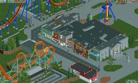
Pashearer that looks really nice, the only thing I would change is the color of the building in the bottom middle. It looks out of place with the same colors as the movie theater (?) overhang.
Just imo. Really nice work though.
-

 Xeccah
Offline
because the side friction looks stupid, what could that possibly be in real life anyway?
I just found this quote funny because this'll be fantasy
Pas, that's good for realism, tho I would try to make it more lively. -

 Twitch
Offline
I dislike that tree object in the far right and very bottom of that screen. It doesn't fit.
 -

 Fizzix
Offline
pashearer, try adding Custom Fence Base's to the sides of those ventilation units. It'll add that stitched together look that they actually have.
 -

 Austin55
Offline
My biggest problem with alot of realistic parks is there is nothing interesting underneath the coaster a lot of times. Some land variation perhaps, and foliage.
 -
 SixFlagsTexas1994
Offline
pashearer, it looks fantastic, but it (un intentionally of course
 ) looks a tad like Coupon's Six Flags Washington. But maybe it's just me..
Still, I will follow the park if it becomes advertized in the forums because the look is very pleasing!
I do like the Superman entrance -

 Ride6
Offline
Here's more architecture
That railway bridge is utterly fantastic. The rest of the screen is impressive but doesn't quite strike me the way that bridge does. But that thing is an accomplishment!A more finished pic of New York street, flip side, and Superman
Very promising. Great flow in the buildings and the overall arrangement. Is this supposed to be a Six Flags park? Because it REALLY "feels" like a Six Flags park. Maybe it's just the Superman coaster color scheme that does that to me...
Ride6
 Tags
Tags
- No Tags
