(Archive) Advertising District / Dump-Place
-
 19-April 07
-

 Ling
Offline
The station simply needs more detail. The roofs need something to even out their transition into the walls. The supports and lift house look good. I'm not a huge fan of the colors of your trees, and I think they need to be more bunched up, with more underbrush. The flowerboxes hanging off the bottom walls of the station seem strange. Some other kind of detail should go there, not something intended for a windowsill.
 -
 Dark_Horse
Offline
I think the station is fine. However, I think the curve between the loops and corkscrews should be over the station. Also, add a third row to the transfer, so it can function properly.
-
 Mattk48
Offline
What do you mean add a third row. I was going to make the break run longer so it will look a little more convincing. As for the station I might Change a few minor details. Will think about modifying the turn between loops and corkscrews. What color should I make the trees ling
 -

RMM Offline
say you have 4 tiles of brakes before the station. those 4 tiles must shift horizontally to one side for the train to roll back onto another section of 4 tiles.
here... the train will stop on the purple grid. the track will then shift to the left and the train will roll backwards onto the other track on the snow for storage.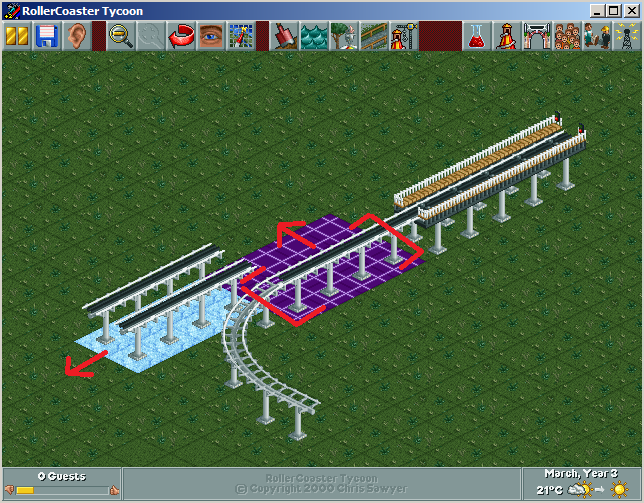
-

 Arjan v l
Offline
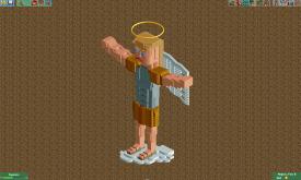
Why is he angry and why are his arms so fat? Looks cool, though.
Maybe he goes to the gym?
-

 trav
Offline
Cos he flies why would he need to have muscly legs. (His arms are more muscly)
Also - It's not just any angel, it's an ArchAngel (Michael to be exact:
  )
)
And he's angry because he's judging you. Yes, you specifically.
 Tags
Tags
- No Tags
