(Archive) Advertising District / Dump-Place
-
 19-April 07
-

 Goliath123
Offline
idk fisch i still feel some sayings are used just to add criticism.
I personall think its fine as is and wouldnt bother adding colour but hey, thats me -

 Cocoa
Offline
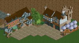
brown path, brown walls, brown windows, brown roof, brown box with a smiley face in it...
I reckon some color could spice it up. at least change the path -

 chorkiel
Offline
Well I kinda do like the taverne as it is. Some detail (flower boxes as fisch said) could spice them up I guess. The other building is clearly too brown. But like I said, I tried building the structures first so I could color them to what I thougt would look good together as it's obviously one brown block.whats with all this add colour bullshit for chorkiel, its fine the way it is. hardly any taverns have greens oranges and teals. add colour to this, oh yeah too brown, ffs certain criticism doesnt apply everywhere
Too it being too blocky, the building on the left was part of like a street of multiple buildings.
If I start building on that map again I'll definitily take your criticism with me to change it for the better. Thank you all. -

 Ruben
Offline
Oh Louis, how I've missed you kicking some 12 topics at a time leaving me wondering whether I've missed a rush of activity only to find out after the third topic it's only you making your dedicated round of commenting on all the stuff you like at once.
Furthermore I agree. A lot of cool stuff in the dump lately. -

 Austin55
Offline
I love louis's commenting. I think reasonable bumps are awesome, getting comments is always fun.
Plus its always fun seeing someone asking how your work is going in a thread that hasnt been seen in a while, means they think about it and gets you motivated.
Hell yea for activity! -
Colorado-Fan Offline
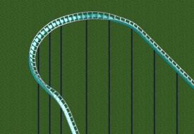
I really love the first screen but you should make the part after the big drop of the Watercoaster a little bit longer. Now it looks painful. The middle age screens are also very nice. Keep on building! -

 Louis!
Offline
I want to like the first screen but the layout just lacks any flow and seems completely random. A roller coaster doesn't have to be realistic in this game, but it does need to look good, look aesthetically pleasing and have flow, which this doesnt, it just sprawls. I also think the work is a step down from your recent stuff.
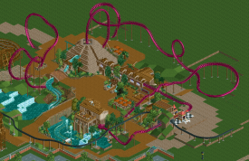
The second screen is wonderful, it really is, there's a lovely combination of textures used and it really works.
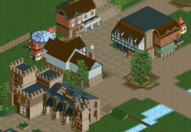
The third screen is nice, not as good as the second, but it has areas of greatness, like the entrance, that's fabulous. -

 trav
Offline
The pizza building in the 2nd screen and the entrance building in the 3rd screen are absolutely fantastic
 -

 BelgianGuy
Offline
I think it all looks very samey and uninspired to be honest, it's like you didn't evolve one bit in the last few projects you've worked on.. don't get me wrong it's good stuff but I'd expect more from someone like you. it's got nothing really eyecathing for me and as louis pointed out that layout just doesn't have any sense of flow or aesthetics.
 -

 Xtreme97
Offline
I like it, but I think you should make the rooves in the last two screens the lighter shade of brown. Other than that the screens look great. The entrance castle building looks amazing.
 -

 posix
Offline
Your style has improved so much but I agree it's pretty uninspired. You need ideas and more fun to just build for yourself.
 -
 AK Koaster
Offline
Moto Coaster Xtreme
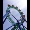
A mega-moto coaster I might be turning into a design. Features a 50 mph launch, two crossed "trick tracks," and a random-photo finish (both sides capable of winning.) Only crashes occasionally:) Comments welcome. -
 Mattk48
Offline
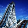
One of the coasters from my new project, cedar creek. Will be starting its own thread soon. still requires some minor tweaking and im not happy with the station. might redo that. has to be perfect, comments welcome

 Tags
Tags
- No Tags


