(Archive) Advertising District / Dump-Place
-
 19-April 07
-

 Pacificoaster
Offline
That bridge looks great CF. As does the foliage and rock work that makes an almost seemless transition of 3 units up to the train on flat ground. What I do not like however are the path choices and the fisherman sprandles as fences. I would either use a deco trim as a curb or maybe even Kumba's queue railings in combination with deco trim. Overall, the architecture is very aesthetically pleasing and the foliage/rock wall is stunning.
 -

 Austin55
Offline
Wow amazing detail there. What's up with the fountain though? I don't guess I understand whats going on with it.
 -

 Ruben
Offline
Wow. Just wow.
I think the sunflowers are out of place, and overused, but other than that just wow! That archy is outstanding. Keep it up!
-

 Mr. Coaster
Offline
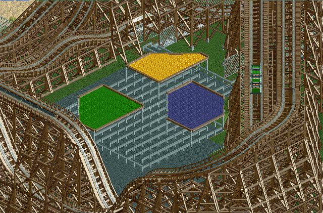
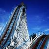
Here's a little more progress on my Dinn. I like the shade covers, but does anyone know of anything better I can use?
-
 Mattk48
Offline
Looks really good mr. coaster. It reminds me of mean streak at cedar point. is this twister coaster layout realistic?
-

 nin
Offline
If that's meant to be any sort of MCSR then it is entirely pointless. For how much speed that thing has I think you're highly constraining it with such a short layout.
 -
 SixFlagsTexas1994
Offline
@Mattk48: a larger layout would benefit you, and add more after the MCBR or like nin said it would be pointless to have it.
@Mr. Coaster: looks fantastic! A cedar fair type feel to it...do you have the 1k queue line fencing? -

 Liampie
Offline
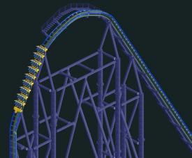
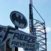
Not fond of the first screen, but the second is impressive. Hope it will be as good as Teravolt or Tornadus.
 -

 chorkiel
Offline
Might as well post this as my interest in building on this is slowly dying.
These are my favorite two buildings I did on this design I had worked on for a while. I still had to colour them but I wanted to first build the structures so it would be easier for me to change to colors to what would work together.
For some reason I really dig that taverne.
-

 Ling
Offline
Brown x 1,000,000.
But the structures look good. I'd try doing the wood siding in white, perhaps? The building on the right needs some colored detailing. -

 BelgianGuy
Offline
And they say kong builds brown!!!
try adding some reds, greens, maybe even teal or orange into that building, Also the structure itself is rather blocky and might benefit from having some parts that are jumping out a little to break it up -

 Ruben
Offline
Wow,... should I know you from anything? Because to be frank I don't, but that looks pretty darn good.
Simple, but very effective. All the details are there and are logical. All I can say is the flat might need some refinement (operator booth, a more fancy fence etc.?) and the foliage needs work as most of it isn't there. Other than that véry impressive.
-

 Fizzix
Offline
Look who's building again! I like it, but I think an Op. booth would be a great addition. Maybe even some fence posts on the grey fence.
 -

 Goliath123
Offline
whats with all this add colour bullshit for chorkiel, its fine the way it is. hardly any taverns have greens oranges and teals. add colour to this, oh yeah too brown, ffs certain criticism doesnt apply everywhere
 -

 Fisch
Offline
whats with all this add colour bullshit for chorkiel, its fine the way it is. hardly any taverns have greens oranges and teals. add colour to this, oh yeah too brown, ffs certain criticism doesnt apply everywhere
it clearly does here though!
You can't argue that the screen is too brown. Of course not every building has lots of different colors and in real life colors are actually way more muted than in rct but this just doesn't work in rct.
Easiest way to change something would be adding flower boxes and changing the path!
 Tags
Tags
- No Tags

