(Archive) Advertising District / Dump-Place
-
 19-April 07
-

 highroll3r
Offline
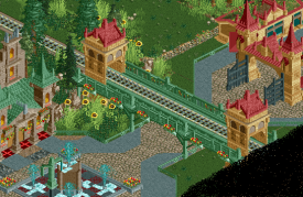
Other than what J K said, it looks great Coupon! Please continue!
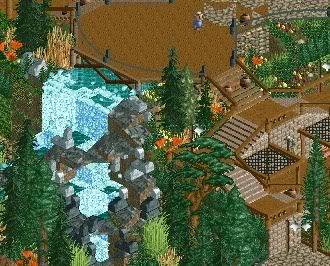
wheres the waterfall coming from this is my only concearn. love everyting els, the elevation is superb. i think because the waterfall isnt an actual river or stream i dislike that aspect of it. the waterfall itself is great though. -

 tyandor
Offline
So, by that logic, if you see a really really fit girl, but she has the same sort of style and look as a lot of other really really fit girls, then you'd go for the not as attractive girl to the side of her just cos she looks a bit different?
Bit of a weird comparison to make tbh, but I'll bite.
Lets just say the best looking one is also the most shallow one and also being the one with a bit too much vanity going on (a.k.a. in the end she's probably a bitch). Sure good for a short while, but nothing worth of a decent relationship and they get stale fast as some off these are easy to pick up.
I personally would indeed go for the slighlty less attractive girl who is more interesting and probably nicer.
Also when it comes to people (not just women) most of the time looks fade, so for anything more lasting it's not that wise to go blind on the visual aspect.
Now back to the game with RoB as example and lets draw our conclusions out of this. RoB most certainly did fade over time visually in comparison with current high-end parks. However, the reason RoB is still interesting has much more going on then just the visuals (which again are dated). Beauty is not skin deep and because of that it has so much more to give that lasting appeal
TBH I'd never have expected to have to make this comparison xD -
 Mattk48
Offline
The park entrance that started that hole conversation about parking lots is being scraped. You guys were right it was missing something and I couldn't figure out what it was
 -

 Ling
Offline
Have you considered how you're actually going to fit a station into that, bennyboy? Also, you should have a longer stretch between the final roll and the brakes, as you're going to have people hanging in the middle of the inversion as the train slows. Not comfortable.
 -

 Twitch
Offline
I really like the idea of the pretzel loop around the station, but it looks cramped on the exit side.
 -

 Jonny93
Offline
Always nice to see new stuff from you! I really like the screen. Especially the fountain seems very interesting to me.
 -

 Ling
Offline
I'm not a huge fan of the red grating in the floor of the fountain area... if you feel the need to have it, I'd make it grey or black. Also, you don't have the diagonal waterfall piece on the workbench? That would work better than some white water pieces atop the diagonal blocks in the fountain.
 Tags
Tags
- No Tags


