(Archive) Advertising District / Dump-Place
-
 19-April 07
-

 Ling
Offline
Agreed on the green. You also need another texture in there, and you should vary the heights of the roofs to make it less boring overall. You can help diffuse the bright colors with more colorful foliage as well, both in trees and bushes.
 -
 Mattk48
Offline
I will take out the trees but what do you mean about the grass BMM. you want it all dessert?
 -

 Fizzix
Offline
Dessert sounds delicious. Try adding dirt and dirt/grass beneath your foliage, and add smaller shrubs and bushes around/under them. Flowers can be used to add more color.
 -

 Mattk48
Offline
Thanks for all the feed back. I don't want to make it a desert theme because it wouldn't match the rest of the park. But here is the new and improved take 2
-

 Austin55
Offline
How about some windows on that building? And the grass and dirt mix looks much better.
 -

 Ling
Offline
Get some shrubs underneath the trees. Use zero clearance in 8cars. Fill it all in (hedge fences are popular too, but I think they look ridiculous). Instead of having the turrets sitting on the normal slanted roofs, why not make flat raised pads for them to sit on? I still feel like you're missing a color or texture, as it's all too bright. Windows/doors would be a nice start, and maybe a different type of flower.
 -

 MorganFan
Offline

I would put some variation of color into those flowers, and make those flags look better instead of just grey. Parking lots like that usually aren't the best idea, so it would be wise to just scrap it, unless you have the white line objects. -

 Midnight Aurora
Offline
I've never understood the appeal of making a parking lot that doesn't have much of anything to do with the park. You do you, though. It's just not visually interesting.
 -

 Mattk48
Offline
Hi guys what color should i make the flags. As for the parking lot i will use the white lines. I didnt in the first place because ive never done it before but ill give it a shot. How do you suppose i make a parking lot that has something to do with the park?
 -

 Ling
Offline
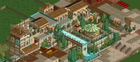
Reminds me very much of Rivers of Babylon. That said, this NCSO craze is getting a little out of hand.
 -

 Austin55
Offline
WOW thats pretty awesome though. I love that. Only thing is the window behind the waterfall might be a bad idea...
 -

 Xeccah
Offline
How come everything I build is reminiscent of RoB when I have not looked at the park for at least 3 weeks?
 -

 Cocoa
Offline
I'm actually quite fond of that shotguns. also, you can definitely have a memory of longer than three weeks
Cocoa
Offline
I'm actually quite fond of that shotguns. also, you can definitely have a memory of longer than three weeksCocoa, the railing up there is curved, and doesn't touch those corners at all. If I put a pole on those corners, it won't even be touching the railing.
put it there anyway, it will look incomplete otherwise. I always (and I'm pretty sure most people) put them on those bits anyway. you can only really tell thats its wrong from the side angles, but its not too big of a deal. -

 posix
Offline
Shotguns, because you copy many of its stylistic harmonies all the time. The screen has a lot of unnecessary details for me and I don't think all that jazz makes sense for a mere carousel?
 -

 Ruben
Offline
Reminds me very much of Rivers of Babylon. That said, this NCSO craze is getting a little out of hand.
This. basically.
 Tags
Tags
- No Tags


