(Archive) Advertising District / Dump-Place
-
 19-April 07
-
 Sey
Offline
That`s old?^^ I didn`t knew it...
The house is very simple, but I like the roof!
And of course your foliage, very good, adapted! -

 Nokia
Offline
that bulding is ugly.
but foliage is good and so is the coaster.Edited by Nokia, 11 May 2008 - 12:14 PM.
-

Dinosaurs Offline
@ ACE: It's fantastic, but goddamn dude, it looks just like your Swedish area in European Oddessy. I'd love to see it a ittle more varied, not only texture-wise but color-wise as well.
@ Freak: Everything you do is awesome, i love it. Its simple but so elegant at the same time.
@ ivo: That hack is amazing, does it work well ingame? -
![][ntamin22%s's Photo](https://www.nedesigns.com/uploads/profile/photo-thumb-221.png?_r=1520300638)
 ][ntamin22
Offline
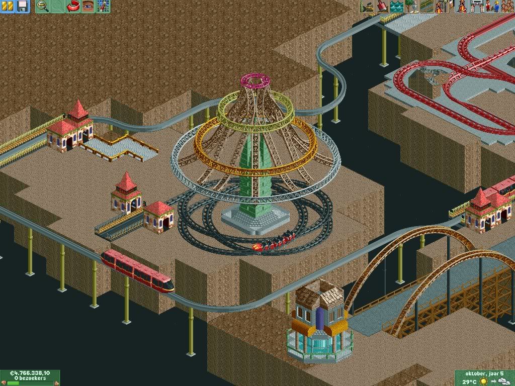
Oh shit, I just realized what that is. Please tell me that works so I can steal it.
 -

 Steve
Offline
Yeah, I don't get it either.I don't get it.
ACE; perhaps throw a little canopy/covering over that small alcove with the brown path, there. I agree about the bathrooms, too.
I look forward to seeing it done!
Freak; it's okay. I can see you're not trying to impress but it doesn't look bad at all. -
![][ntamin22%s's Photo](https://www.nedesigns.com/uploads/profile/photo-thumb-221.png?_r=1520300638)
 ][ntamin22
Offline
@ Zodiac and Steve-
If it runs, and the black track is made invisible, he has a working flat ride that will run perpetually, since none of the track overlaps on tile edges and the train continues on around the circle. If you wanted to take it a step farther you could make three other tracks just like that but offset by 1 tile height, make all the track invisible, and have something like the Golden Zephyr at California Adventure.Edited by ][ntamin22, 11 May 2008 - 05:50 PM.
-

 gir
Offline
I like it. It has a really crisp, real feel to it. I'm not sure where you're going with the ride because at the moment it's missing some things essential to a rapids ride (fences, rapids, walls, bumpers, etc.), but hopefully that's the unfinished part.
 -

 Sey
Offline
I like it too, it`s simple and it works with me, but the "lake" looks a bit dead, hope you understand^^
It`s nice, withal unfinished!
 Tags
Tags
- No Tags


