(Archive) Advertising District / Dump-Place
-
 19-April 07
-

 CoasterCreator9
Offline
I like the layout, but I feel the brake run at the end needs to be much longer - long enough to stack two trains outside the station. And as a nitpick I'd swap the rail and spine colors on the vertical drop.
Thanks, I've been needing some nitpicking on those colors, I was really on the fence about it.
I'll also work on the end/brake run a bit more to lengthen it. -

 salsaontop
Offline
@Posix - Ok, I understand.
Coaster creator it's a nice layout, quite large and not compact. Perhaps just a little bit short but I can't tell just from pictures.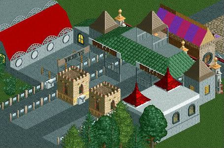
^Park entrance area for a park a long way off in the future. -

 MikaRCT2
Offline
The two small castle towers don't fit.
Furthermore there is a bit too much grey IMO. -

 salsaontop
Offline
^Maybe I need a bit less grey. I kinda like the castles seeing as when I do actually build in this park there's gonna be a castle. But I'll see what it looks like if I change them.
-
 SixFlagsTexas1994
Offline
^Take a look at others ticket boothes, using the castle towers seem to pop out too much and not in a good way
-

 salsaontop
Offline
^I hope I can delete them as I think they're outside the park, if not I'll have to make them fit better somehow.
 -

 Arjan v l
Offline
^^ You can use 8-cars to switch land (inside or outside the park) or to own all of the land.
Make sure you have back up savegames when you use 8-cars, in case it goes wrong.
-

 Ling
Offline
It seems like your support colors are reversed. The pots are a bit strange. Not a huge fan of the black footers. Everything else looks great though.
 -

 Cocoa
Offline
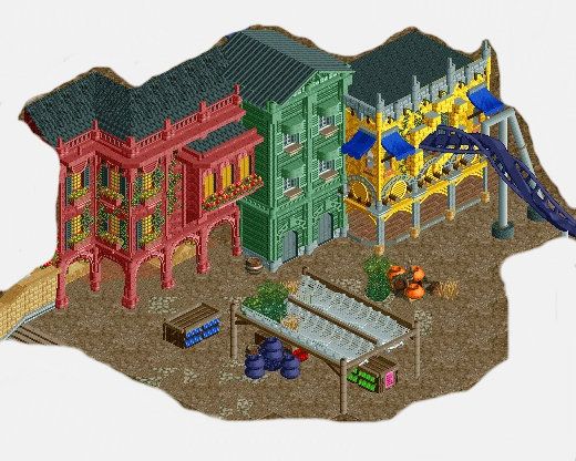
I know I'm not really one to speak about ridiculous colors... but I feel that might just be a bit too much. As in, I find its better to have some sort of base color (usually brown, grey tan) that sets the mood for the area and makes the theme feel more concrete. In your case, I would say a lot of the details should be a dull brown or grey or something, as opposed to just the colors of the building. so the arches over the path on the red building would be grey + brown and the detailing would be duller to make the colors on the building really stand out and build an atmosphere. Also, consider changing the bottom texture of the green building to some grey brick or something, I find buildings tend to look nice with a solid base that is different from the body.
But that's just my thoughts on color theory or whatever, seems to work from me but do what works best for you. just trying to help make the atmosphere 'pop'.
also, don't forget to theme the inside of your buildings! this is a must! and vary up the colors on your racks of things, it will look more exciting. -

 Ling
Offline
I think the brown path does that for him. The brightly colored buildings stand off of it very well.
 -

 salsaontop
Offline
I really like the coaster coming out of the building with the damaged wall. I also like the texture of the path. I've never seen that before. May I ask what type of path it is or how you've made the path like it is.
 -

 J K
Offline
Keep it all, it's different and I applaud that. That ground texture is lovely but I do think you need to work slightly harder to make the textures really work for you. That's only because of the block colour straight into the dark moody path, if you find a way to harmonise the two the theme will start you work for you so much more.
Also decide on a roof pattern and stick to it, the various textures are throwing your theme off slightly because the wrecked wood doesn't match very well compared to Darren's roof object. -

 Ling
Offline
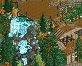
Water's too bright... make it plain teal. I'm not a huge fan of the orange, but I'm not sure what I'd want you to change it to. Maybe white or purple. Looks great otherwise.
 -
 Fizzix
Offline
The water is just plain teal? I don't know why it appears otherwise, maybe the 1k Fog? I'll fool around with colors.
Edit: Just realized, I used the 1k gardens(like in the top of the screen), and they include both white and purple.
 Tags
Tags
- No Tags
