(Archive) Advertising District / Dump-Place
-
 19-April 07
-

 Fizzix
Offline
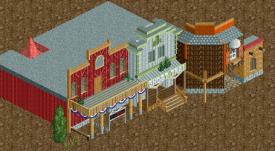
That building is very boring, give it some more personality. I'm not a huge fan of the jungle fence and tarmac combination either. All that empty grass really detracts from the atmosphere, I would fill more of it with foliage.
 -

 robbie92
Offline

Stop by Oswalds for all of your merchandise needs, or the Chamber of Commerce for any park-related information.
-

RMM Offline
RMM you can definatly see that he is right. He does have some dull spots on the map.
no, the wording, 'completely unfinished' is just a total mind-fuck.
i feel the red is a bit strong, robbie. it doesn't really compliment the other buildings. -

 djbrcace1234
Offline
Are you doing a full recreation or are you improvising? It's stunning nevertheless.
 -

 salsaontop
Offline
Small 80 by 80 park that I'm starting. Advise would be appreciated.
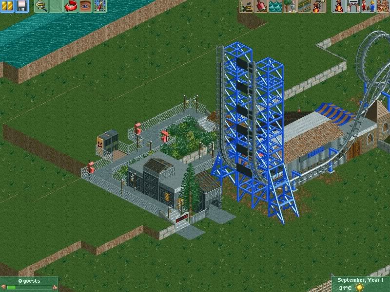
^First coaster.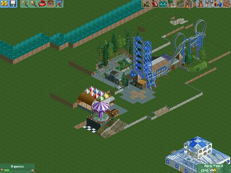
^An overview I'm working on.
~Salsaontop~ -

 salsaontop
Offline
^Ha ha I got the same feeling on Robbies pic. In terms of a theme it is pretty generic although I'm using quite a bit of wood and jungle sets around the ride.
-

 FK+Coastermind
Offline
he meant, what is the theme for the coaster? not what type of themeing scenery, but what idea are you trying to capture, old factory? jungle? for example, all Batman coasters are themed to destroyed Gotham and Batman swooping in to save the day.
FK -
 SixFlagsTexas1994
Offline
Reason I asked is because I see many different theme elements in the coaster
 -

 salsaontop
Offline
^I hope I'm correct in saying I plan on it being just a standard boomerang coaster. No real theme I just wanted to mix up the sets and see what it produced. It's an experiment. However I'm very much pen to advice on what not to use with what.
~salsaontop~ -

 Austin55
Offline
Robbie-Your brilliant for only ever posting at the top of the page. Looks very Nin, which is good! Cant wait to see what all your working on.
 -

 posix
Offline
salsaontop it does look like a bit of an industrial theme though. You can't hardly avoid creating a style (=theme) and I don't think you have. The colours are pretty wild, especially with that colourful bit next to the Boomerang.
First step for every parkmaker: create a vision of what it is you want to build. You need to use your imagination and real life park experiences and knowledge. You need a brainchild to translate to the game. It doesn't look like you have one as of yet. -

 salsaontop
Offline
^I see what you mean. I suppose it's hard for me at the moment to pick up on real park experience as I haven't been to one in about a year. I think I've got an idea now off what theme I should have used but haven't got the right sets. Thank you though for pointing me in the right direction.
-

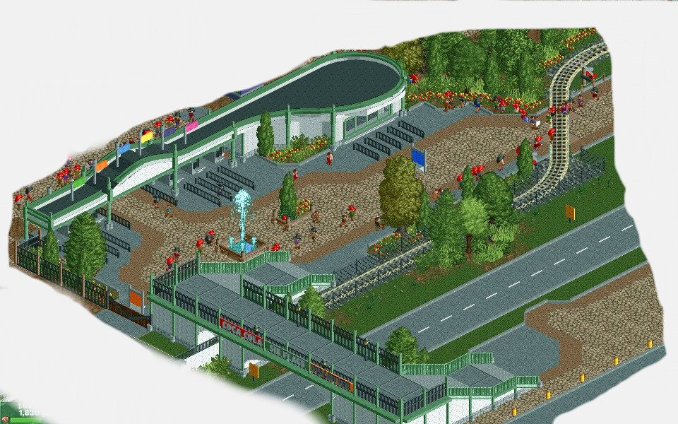
 Austin55
Offline
That looks really good man! I like that bridge a lot.
Perhaps some sort of HVAC or something on the roof of the office though? -

 salsaontop
Offline
Coupon that's a great entrance. IF I could make one like that I would probably pass out from shock.
Austin55 the facade looks great. Maybe some form of window on the brown wall though. I don't no of any cs sets with diagonal windows though.
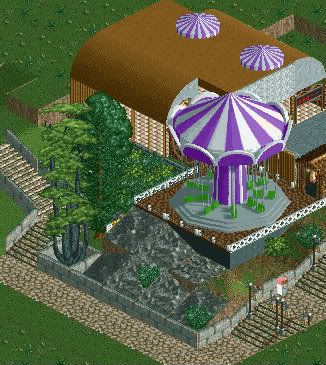
^I believe it was Fisch who yesterday said that I should change this to more off a cliff. Should I be making it more pronounced than this as in should it be steeper higher up etc...
 Tags
Tags
- No Tags
