(Archive) Advertising District / Dump-Place
-
 19-April 07
-

 Phatage
Offline
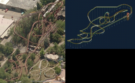
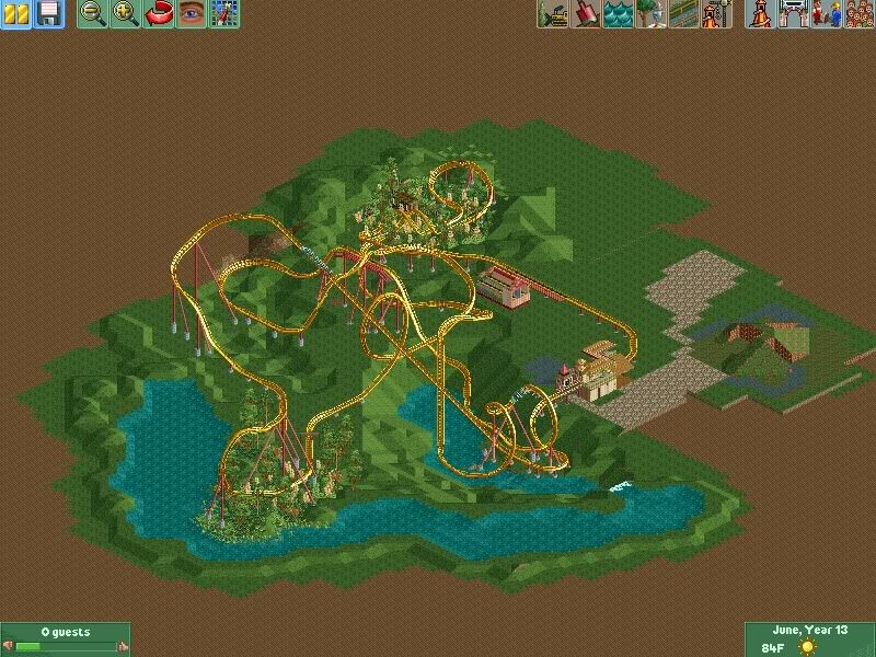
I think it's pretty good, tough with the size of the loop not being available in the game and some other off-axis angles. I think the second half the ride can be tightened up a little, I know you made the corkscrew the way you did to better line the track up with the station at the end but I think it's possible to make it an actual corkscrew and accomplish the same thing.

-

 Ling
Offline
I like yours a little more Pacific, the ending is a little less splayed out - more cohesive.
 -

 Ling
Offline
Seeing as you play in 800x600, it's a little hard to tell. I think the bit between the zero-G roll and the MCBR is a little too drawn-out. Can't comment on the foliage. Having a huge element like a cobra roll after the MCBR strikes me as odd.
 -

 Cocoa
Offline
not a fan of that drop, its just too spread out and awkward. layout is generally OK, but that landscaping makes no sense, the dip in the middle would just fill with water to the level of the surrounding lake
also, you have the land around the lake lowered. I find that often leads to flooding problems. -

 Turtle
Offline
I thought that was the best part of Parque Warner as well, that looks really really good.
 -

 Ruben
Offline
I thought that was the best part of Parque Warner as well, that looks really really good.

Makes me wonder: Did you inspire Nin or did Nin inspire you? I wanna give praise to the one who came up with it in it's current, high-detailed form, but I'm kinda lost for who's idea it exactly was. -

 trav
Offline

Makes me wonder: Did you inspire Nin or did Nin inspire you? I wanna give praise to the one who came up with it in it's current, high-detailed form, but I'm kinda lost for who's idea it exactly was.
Look at the locked topic in the Replacements forum, that will give you your answer
-

 RCTNW
Offline

How the hell do you all come up with all this micro detailing? As much as I love the look, I wonder if this ubber detailing is contributing to the decline in finished parks. I mean this is what a 7x7 area and I can only imagine how long this took and the number of objects used
That said, I really like the look, I hope to see it finished someday
James -

 imawesome1124
Offline
If you're going to make an entire park with that level of detail you'll never finish it. Don't get me wrong it looks amazing, but it's really over-detailed imo.
 -

disneylhand Offline
I thought this was obvious and common understanding?As much as I love the look, I wonder if this ubber detailing is contributing to the decline in finished parks.
As someone who has bought into building with detail at this level, I find it much easier to stick with projects on the scale of a standard design. After all, if I were to make a full-scale park it would essentially be six+ designs on one map with an entrance.
-disneylhand
 Tags
Tags
- No Tags


