(Archive) Advertising District / Dump-Place
-
 19-April 07
-

 Arjan v l
Offline
No need to be sorry, but i'm glad you've learned from it.
Filled screens, so i won't complain about that.
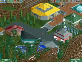
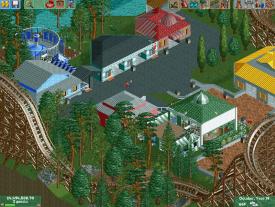
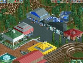
I can see you've been playing with architectural forms, nice.
Detail is something you might try to improve or understand.
The buildings look bland.
Nice colours in some buildings ,but some colours are not suitable, like the yellow roof, it screams: i'm here.
Keep it up though.
-

 Faas
Offline
You don't have to apologise mrbuckeye, it's just older members thinking they have the right to be a dick.
 -

 AvanineCommuter
Offline
You don't have to apologise mrbuckeye, it's just older members thinking they have the right to be a dick.
Everyone has the right to be a dick. -

 Ruben
Offline
BC: I see some serious improvement in that archy! Nice job on that. Not so sure about the alternative layout though.
Mrbuckeye: Sorry, but still not really seeing the difference. The buildings still feel randomly placed and incoherent. Maybe try to cluster them, instead of scatter them all over the place. Also, get some height in those structures. Almost everything you show us is only 1 story high. Don't be afraid of getting some height in those buildings 'cause it'd make them look a lot less disproportionate. -

 BC(rct2)
Offline
Thanks. I don't understand too much about stats, what I do is see if the stats have something redNice idea, but the speed loss probably makes the inversions either painfully fast or painfully slow.
 But I have the stats here:
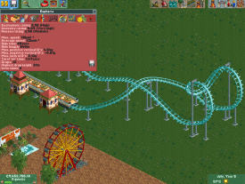
Thanks for the feedback! The building is finished but the landscape around is not so I was afraid that someone said to make finished screens. I'll improve on the foliage, architecture, around the hostel and the path before the ferris wheel. But thanks again :]BC, I really like that honestly. Its the best work I've seen from you yet:]
Although, there are a few basic things that could help benefit you once you become more comfortable with their implementation.
- Improve the foliage. Try and make it look more natural! What you have right now with the palm trees isn't bad, as it denotes symmetry and organized style leading up to the building. However, foliage is still one of your weak points [as it is for me as well!] Once you master the art of believable foliage, your creations will truly come together.
- Vary the elevation. Even if its just a tile or two higher, slight variations in elevation between areas helps build atmosphere greatly.
- More buildings! Real parks tend to have buildings that are conjoined with one another. I think that building something alongside the border of the brick path leading up to the bottom right corner of the hostel would be greatly beneficial. Make some facades on the path side, and possibly place some foliage along the backside to cover it up a bit. If you connect it to the hostel, you could extend the theming a bit more as well! Possibly a gift shop or something.
I think you have the potential to be a great builder in time. You have a good creative vision and are improving steadily:]
Keep it up!
Thanks! If this layout looks too intense, I'll try to make other original layout.BC: I see some serious improvement in that archy! Nice job on that. Not so sure about the alternative layout though.
-

 Seb
Offline
@mrbuckeye: I'm not very keen on interfering with the work of other people but in this case I'm wondering what kind of ideas you had in mind when you were building this. Like others have said it looks very bland and the colours you're using look randomly selected. I'm not saying that everything you build should have a well thought out concept but you will get better results if you googled some architecture you like and tried to recreate them or in some way integrate some elements in your work. Even 1-story buildings can have more life in them than you are showing right now. Not trying to be a dick here, I just want you to realise that this game has more potential than you are using at the moment.
@BC: it looks unpleasent if you have to travel backwards on that layout. As part of a full closed circuit with a normal lifthill it might look great though.
Gr Seb -

 BC(rct2)
Offline
I do what is need to make it look better, but I like the layout in the way it is.@BC: it looks unpleasent if you have to travel backwards on that layout. As part of a full closed circuit with a normal lifthill it might look great though.
Gr Seb -

 Scoop
Offline
yeah just like you have the right keep your pussy.Everyone has the right to be a dick.
haha.
anyways I thought I saw progress with myself. oh well I guess it's back to the drawing board
-

 Wanted
Offline
yeah just like you have the right keep your pussie.
haha.
anyways I thought I saw progress with myself. oh well I guess it's back to the drawing board
Avanine - I love your "pussie" -

 AvanineCommuter
Offline
As do I; it purrs so wonderfully!
@buckeye while it's GREAT that your screen is complete (or at least filled), it hasn't been filled with anything distinctive. I mean, can you imagine yourself walking around in that park? Does it feel "lively" or "atmospheric" to you? Do those buildings look like something that can be built in a real life park? How about the planning? Are carousels really sunken like that? Are flat rides really placed hidden behind two buildings so peeps can't see it from the path? etc. Asking yourself these questions will help you realize that you need to step up in the amount of effort placed into planning/building your parks.
I find that the best way to improve is to look at real life examples of architecture and try to copy them. Once you get good enough at expressing real life architecture through the RCT scenery objects, you will have a good grasp on how to use them to then express what you want to create yourself. Give that a try. Search up Cedar fair pics or Universal studios IOA pics and try to see if you can recreate what you see there with what's given in the game. -

TwistedHelix Offline
Hey guys just opened up RCT2 for a few hours to mess around with it. This is probably the first time I've actually tried to make soemthing seriously with CS. Porbably won't go anywhere and the colours are annoying me as I can't get them right but its better than anything I've done before so meh.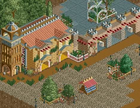
Oh yeah theme is menat to be kinda Spanishy for some unknown reason given the fact that its menat to be a nature park in England. Yer........
Anyway enjoy (hopefully)
TiwstedHelix
EDIT: Oh yeah its also not finished but you'd probably guessed that by now. -

 Casimir
Offline
Apart from the overgrown path, it looks great!
Keep doing CS once in a while and your work will look more refined in no time. -

 rct2isboss
Offline
A little to much variation in color but the general idea is great! Really excited to see you do this. Keep it up.
 -

TwistedHelix Offline
Casimir: Thanks and yer the overgrown pathways didn't reall work that well to be honest as the plant glitched to much.
rct2isboss: Hmmm I was worried there was too little colour variation to be honest lol but gald you liked it otherwise.
In:Cities: Thanks and to be hoenst I agree that slithgy more coloruful is funner to look at.
Well guys to cut a short story shorter, I'm a idiot that forgot to save the bench with that building in it so thats all gone. I have however started again (and this time remember to save it) with a park in the same style but just I've mad ethe ticket booths and pre entrance area. Not really that much again jus showing bits and pieces though I am going to try and replicate the actual entrance gates intot hat building above again.
Anyway I'll shut up now and here's another small screen.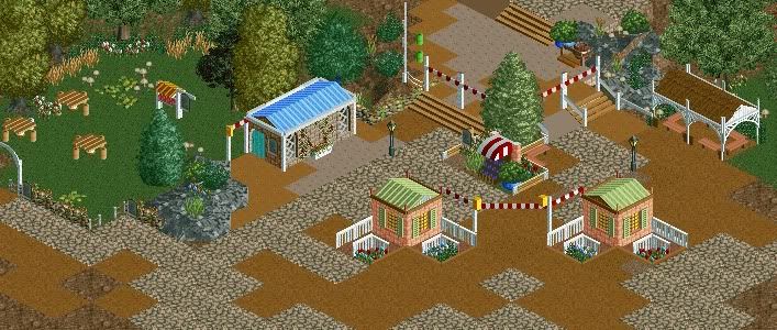
Oh and rct2isboss this one is even more colourful sorry =P.
Cheers
TwistedHelix -

 Fizzix
Offline
I want to like it, but the path prevents me from it. Please do away with all of brown stains. If not, at least round them off with flat roof scenery. I love the little tables and the colors, but that path needs some work.
 Tags
Tags
- No Tags
