(Archive) Advertising District / Dump-Place
-
 19-April 07
-

 geewhzz
Offline
It's very enjoyable, but there needs to be a much more secure low-zone fence for that coaster.
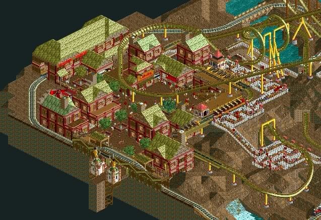
I think the variation of trees in the center of the paths varies way too much...those are the types of trees a park will plan when they construct the area and they would most likely be the same type. -

 JDP
Offline
There are a lot of textures being used in the screen, but man it just reeks atmosphere. Good job on that.
-JDP -

 Carl
Offline
In the words of the all-knowing Bill & Ted, that is a most triumphant screen, Sey!
Say, Sey (lol), I've never seen you around before recently, yet you seem to be very experienced with RCT, have you been a member of the European RCT community for a while, just coming over here now? -

 Fisch
Offline
Actually he is a friend of Fr3ak and mine. He's been around in the German community for a while but give him his time to find out his own style as this still looks a bit like a mixture of what Fr3ak, 5Dave, Petrol and me are building.
Anyway, this looks great as always Sey.
Go on with that! -

 Nokia
Offline
thats one of the best screens i've seen in a while.
it may have alot of textures but it looks good. -

 Sey
Offline
Hey, thanks a lot!
I didn`t known the Screen will arrive like this!
@Carl: Yes, I´m coming over here^^
Before, I was active in some German communities like RCT-World or WonderWorlds.tp, still now...
I haven`t made many parks until now. ;-)
@Fisch: Thanks!
Cause I haven`t made many parks, I didn`t "found my own style". maybe you`re right.
Thanks Nokia^^

Edited by Sey, 06 May 2008 - 01:49 PM.
-

 JDP
Offline
I don't know what maker you are going for but that turn around might be a little too wide. Other than that it looks great ACE.
-JDP -

 Levis
Offline

entrance will be invisible and have to do foilage still ... maybe I will start a add topic for this.
aiming for design -

 Sulakke
Offline
All buildings are the same and I don't like the coaster colours at all, especially the supportcolours. The interaction is nice though.
 -

 ACEfanatic02
Offline
Eww. Sorry, Levis, but those colors are terrible. That green doesn't look good on anything but foliage, and all of the of the rest are accent colors. There's no neutral base color. (Aside from brown.)
@JDP - John Allen. And it's in proportion to the size of the coaster (110 ft. out and back.)
-ACE -

 JDP
Offline
^Nice. Maybe a little slope when coming off of the turn around though... just a thought.
-JDP -

 JDP
Offline
^Not at all. The train should be hitting the turn around at about 18-25 mph, so a little dip leading in to a 45 degree bend shouldn't effect it at all.
-JDP -

 Levis
Offline
the slope isn't possible anymore.
the train now makes it to the station but it doesn't with a slope.
@ ACEfanatic02 -> luckly I still have to do the foilage so the green will look good in the end.
and why can't brown be a base color ? -

 ACEfanatic02
Offline
It can. But those accents don't work well with brown. (And the proportions of accents and base are way, way off.)the slope isn't possible anymore.
the train now makes it to the station but it doesn't with a slope.
@ ACEfanatic02 -> luckly I still have to do the foilage so the green will look good in the end.
and why can't brown be a base color ?
-EDIT-
@JDP - Are you referring to the turnaround in my pic? If so, I tried a small slope coming out of the curve, but it looks like shit and screws up my height proportions for the rest of the ride.
-ACEEdited by ACEfanatic02, 10 May 2008 - 08:45 AM.
 Tags
Tags
- No Tags


