(Archive) Advertising District / Dump-Place
-
 19-April 07
-

 Xeccah
Offline
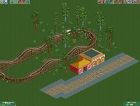
You should build closer to the edge of the map....
I'll take that into consideration
but the reason for that is that it is the entrance to a design, which I would be expecting to finish in a couple of days. -

RMM Offline
You should build closer to the edge of the map....
oh, i get it. with the '....', you're implying that he shouldn't. clever, you. -

 Midnight Aurora
Offline
I get it. with the "oh, i get it. with the '....', you're implying that he shouldn't. clever, you.", you're implying that you know he's being sarcastic, but you're being sarcastic about. It's so meta it's meta.oh, i get it. with the '....', you're implying that he shouldn't. clever, you.
-

 BelgianGuy
Offline
if that's an entrance make it wider, give it more room, looks very claustrophobic at the moment, give it space, make it more inviting and welcoming
 -

 Casimir
Offline

It's really WAY too close to the edge. The structures are somewhat interesting, though. -

 AvanineCommuter
Offline
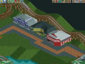
here is a couple of shops along the side of a main street and bunny hops of a coaster.
... please stop posting unfinished and uninspired screens. Can you PLEASE actually spend more than a few hours on a screen just to get a response? Try working at least for one or two days and have something complete to show for feedback. -

 Fisch
Offline
First serious attempt at CS, and I hope it does not dissapoint.
I like that a lot! Good atmosphere! -

 AvanineCommuter
Offline
ok please please tell me what wrong with posting like that.
1. It gives the impression that you're building more for attention and comments rather than for fun/love for the game.
2. You're showing low quality work which you've obviously only spent a minimal amount of effort on.
3. You're not getting better because you're not taking your time.
That's why.
So get off of NE for a few days, build and practice, looking at other parks for inspiration. When you've put in at least a day's worth of honest effort, then post for feedback. -

 Pacificoaster
Offline
Here's a screen of a new design I am working on. The foliage is not complete but I will add more plants and buildings later.

mrbuckeye: Essentially, that is what you have been showing regularly and could you see yourself commenting on something like that? Put yourselves in our shoes for a second and try to realize the quality of work you keep posting. I could I only see maybe an hour to two tops for the screens you're presenting and they just lack passion. Many of the members here take time to present screens that are of finished quality and it usually yields more comments. Just take some time looking for inspiration by studying architecture, foliage, landscaping,etc through search engines like google images/ bing maps and see what you can come up with. The buildings you are creating have no identity, the foliage is planted in what seems to be 20 seconds, and the atmosphere is dull. -

 Arjan v l
Offline
^^ Well ,the time you're spending to get these screens in a topic and then ofcourse checking your post regularly ,to see if you have response, is valuable time ,that you could have spended on your work/park/design, to make it look more pleasing.
Enough said i think.
Edit: post is for mr buckeye -

 Ling
Offline
Cut down on the fire a bit (after all, shouldn't it be drowning?), and maybe bury the bases for the objects one level down so it doesn't all look the same and appear to be sprouting from nowhere.
 -

 Scoop
Offline
Here's a screen of a new design I am working on. The foliage is not complete but I will add more plants and buildings later.

mrbuckeye: Essentially, that is what you have been showing regularly and could you see yourself commenting on something like that? Put yourselves in our shoes for a second and try to realize the quality of work you keep posting. I could I only see maybe an hour to two tops for the screens you're presenting and they just lack passion. Many of the members here take time to present screens that are of finished quality and it usually yields more comments. Just take some time looking for inspiration by studying architecture, foliage, landscaping,etc through search engines like google images/ bing maps and see what you can come up with. The buildings you are creating have no identity, the foliage is planted in what seems to be 20 seconds, and the atmosphere is dull.
Pacific that sucks besides my work wasn't that crappy. any ways it doesn't matter. you like being a dick sometimes and thats your style
 Tags
Tags
- No Tags


