(Archive) Advertising District / Dump-Place
-
 19-April 07
-
 ScOtLaNdS_FiNeSt
Offline
@pacific: Yeah i was thinking that myself i will add details and shit to break up the complete brickwall, I had it as a wooden bridge with crossbeams before but it just didn't look right.
@JJ: Cheers mate.
@Posix: Thanks, Its supposed to be more of a abandoned mine theme rather than western but its pretty similar.
Anyway for anyone that cares ... This will be a design based on a small abandoned Goldmine town called "BustTown" As it was a "Boom" town at one point. But over the years it has grown abandoned and un-used. I would be happy to build just that but, being there is no concept creation anymore it wouldn't be viable nowadays. The coaster is called "GoldRush" which is suitable i think being its a launched coaster.
Anyway...
Keep an eye out for this one
-
 coasterfreak101
Offline
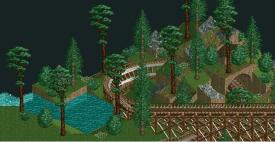
Pacificoaster, the only problem with that layout is that almost every single turn is to the left. Particularly every turn after the station fly-through, with just that one exception before the laps around the layout start. Beautiful layout aesthetically, just lacking in any directional changes after the first two turns.
 -

 FK+Coastermind
Offline
Pac, a beautiful layout. My only issue is, i'm all about coaster-peep-archy-landscaping interaction, and it's hard to theme a coaster so tightly wound together. It's a wonderful layout, but i think is bordering on "clump of track" if not themed perfectly. That being said, ur the man to perfectly theme it.
FK -

 AvanineCommuter
Offline
NASCAR: The Ride
For a woody?
The layout looks fine but as FK says it is bordering on a "clump of track" in the center. For me, whether or not this works depends on the themeing.
For pure layouts (non-themed), I prefer something with a longer line and some directionality. -

 Twitch
Offline
Looks like the joke just did a station flyby right over your head.
And it looks like a fantastic layout. Can't wait to see what setting it will be in. -

 Ling
Offline
Glass, castle, tile, and wood, all within one wall height? (or nearly) - I'd cut down the number of textures. The colors could work, I'm not really sure without seeing a larger screen. Same goes for the foliage.
 -
 rct2isboss
Offline
Foilage and more detail in the water needs to be added. Other than that its okay but not much.
 -

 Ling
Offline
Landscaping is too random. You need to have detail under the water too, don't just drop grids of 3x3 and 4x4 and fill it with water. You have to slope down into it. Also, that arch isn't supported by land, you can see right through the bottom on the left there. The piece at its back has to be a lot higher. Foliage needs to be denser with more underbrush.
Shotguns, I must have just seen the monorail through the top of the wooden full-height balcony fence and thought it was glass. Either way, I still think it's a few too many textures. -

 AvanineCommuter
Offline
I think mr. buckeye should get a two week ban in the ad. district just so he can focus on BUILDING and less on SHOWING SCREENS.
 -

 Xeccah
Offline
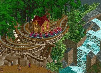
Just getting back into the swing of things...
-Storm
Nice atmosphere,ALMOST gives Avanine's prior screen a run for its money in that department. -

 Maverix
Offline
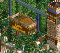
Not sure how I feel about the overhanging trees at the top, but the rest is gorgeous.
 -

 Cocoa
Offline
nah, the overhanging trees seriously make the screen. it gives it a really wonderful, jungly, overgrown atmosphere and it feels so lush. nice screen.
 Tags
Tags
- No Tags


