(Archive) Advertising District / Dump-Place
-
 19-April 07
-

 BelgianGuy
Offline
gijssie, I don't get why you'd go for overgrown in that place in the park, I mean it's right between 2 used paths so I'd say make it planted and not even slightly overgrown...
 -

 nin
Offline
Don't manicure the foliage. Just change up the colors. It's too pale-green at the moment.
 -

 Fisch
Offline
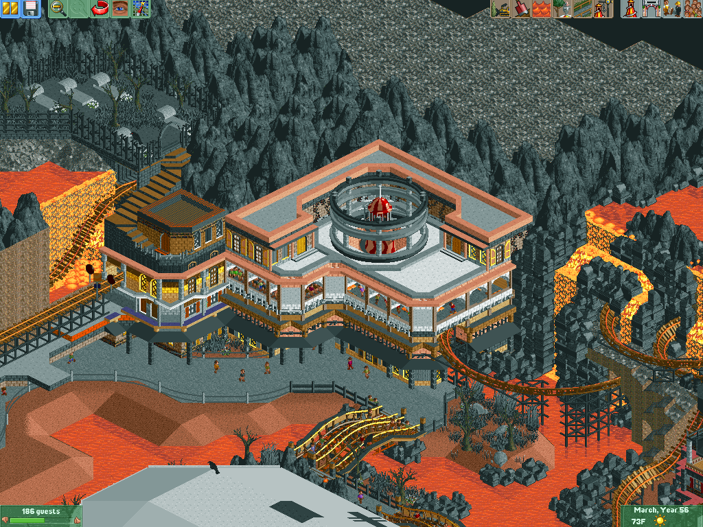
Still trying to get back into park making and such, here's a palazzo:
i just had to write a paper about palazzo medici and palazzo strozzi for university. I like how you even added the socket. Pretty good shapewise but I'd change the colors to something more florentine
-

RMM Offline
^ very cool.
gijssie1234, the more and more i look at that screen the more i appreciate it. -

 In:Cities
Offline
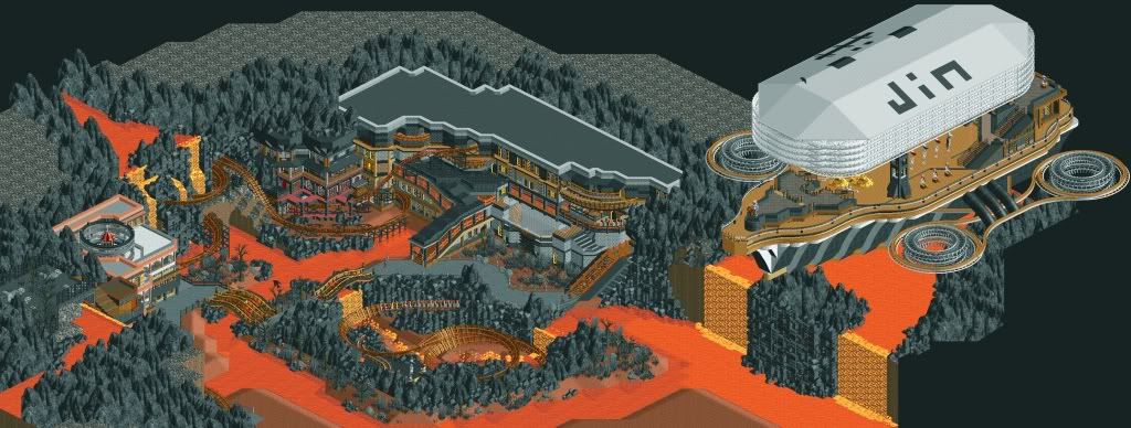
Wow. That is by far the coolest thing I have ever seen in RCT2. Absolutely incredible. It looks like an entirely different game!
 -

 Ling
Offline
I really like it, especially the airship. Everything except for the overuse of 1k ruins, and maybe some of those colors on your structures. They clash quite a bit with the orange.
 -

 A.S.Coasters
Offline
That's really creative, I like it.
Logo got messed up a little bit, but it still get's the point across.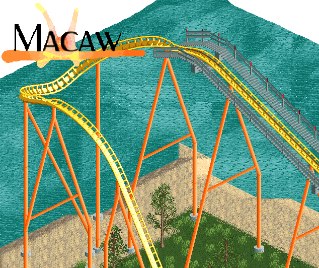
-

 AvanineCommuter
Offline
I can't see school_Jin's images, but I am reading all these comments and I'm honestly feeling a bit left out.
 -

 MorganFan
Offline
I'd say it needs more foliage, but I have no idea how anything could even breathe there.
 -
 gijssie1234
Offline
I want to explain a few things about the foliage, There are parts of the park where the natural form of vegetation will come back, and in my eyes a natural form of vegetation look like this .and as a natural forest does not consist of single trees, so you get a more mature form of forest.
http://static.deskto...igthumbnail.jpg
it is not that each side of it looks like this,

orange. Here are some flowers planted.
yellow. there will be benches, there are also lights to be placed etc.
red. i will change some bits at the foliage -

 posix
Offline
Scot, that is very refined and nice. Really convincing western theming you have there, and albeit so detailed most of the details make sense. Love how the path level is above the track, too.
SchoolJin, super cool, as always. Great to see something from you again. You keep the RCT2 fantasy style fire burning. -

 BC(rct2)
Offline
School_Jin
A.S.Coaster, the supports are so awkward.
gijssie1234, looks amazing, great atmosphere there!
Pacificoaster, nice layout! -

 MorganFan
Offline
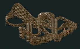
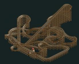
Not to attack or anything, but I can't see any way how that woodie makes it through the layout. It looks insanely long, and doesn't look that tall. I would say reduce the laps around the layout at the end to one, instead of two.
It looks great and all, but it seems like it would be very slow at the end.
 Tags
Tags
- No Tags

