(Archive) Advertising District / Dump-Place
-
 19-April 07
-

 CedarPoint6
Offline
I tend to like grey footers seeing as few parks paint their concrete, but that's a personal preference. Once you hack a few under the water, It'll be very nice. Don't forget to take those stairs to the ground so people can actually get up the lift! Looks really nice.
 -

 Dimi
Offline
I just forgot to hack the footers, and I've accidentaly deleted that piece of the stairs. I'll fix it. Thanks to all!
 -

Dinosaurs Offline
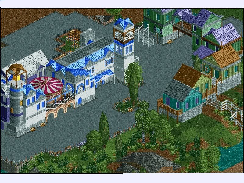
something new. i'll probably start a topic in the Ad when i have a little more done. -

 CedarPoint6
Offline
This looks pretty nice, although from a realistic standpoint, the carousel would be out of view from the path. Generally you want that in full view, so you may consider a larger ride like a Top Spin that's large and visible. Your textures are awfully varied, although I think if you changed around the white building in the center to better reflect the stuff on the right, then that would be better. I think it would be nice if the lighthouse stood out from the rest. Still, looks pretty nice so far.
 -

Wicksteed Offline
the buildings in the middle don't fit the ones on the right.
they look very good separately, though. -

 Comet
Offline
Yeah, you need to get rid of some of the arches.
And make some of the buildings a tile back or forward so it's not straight.
Everything else is great. -

 nin
Offline
it's nice petrol, but work on that middle building.
ticket booth. .
.
sry. never got any feed back.
 Tags
Tags
- No Tags
