(Archive) Advertising District / Dump-Place
-
 19-April 07
-

 RWE
Offline
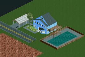
@BigB Looks good, but I think It needs some detail on the water. Maybe some plants or something else. But the architecture is beautiful. I want see more from this.
Gruß RWE -

 Version1
Offline
@ BigB
I like the screen, although I think the combination between the brick walls and the castle walls is a little bit strange. -

 MCI
Offline
and brown!Looks nice, but it's pretty flat.
Try to mix a bit more colors in there!
I like the combination of different walls, though. -

 posix
Offline
RWE, the colours are interesting, but please, take a moment and learn what a direct link to an image is.
 -

 Ruben
Offline
Core shapes and textures are okay, but what you're missing is detail.
-This house is in desperate need of some trim, some beams, something to give it a bit more body to it.
-The windows could use some diversification, extra detail, whatever. Maybe some flowers?
-That pool is véry simplistic. Why is there no way to enter through the gate? Don't people like some chairs at a pool? Couldn't it use a ladder on which people could get out of the water? Maybe create a stone edge with some trim around the pool so it doesn't look like it could overflow any second. That kinda stuff.
So really, the shapes, colors and textures are good. You'd have to work on the detailing, foliage etc. to ''improve it''. It basically needs to get a better atmosphere to it. -

 imawesome1124
Offline
@5dave: The beach is on the other side of the road. Across from that house there will be a motel and next to the motel will be the boardwalk park.
@Ruben: I'll do that, and I just realized that I completely forgot to put a door to the deck lol.
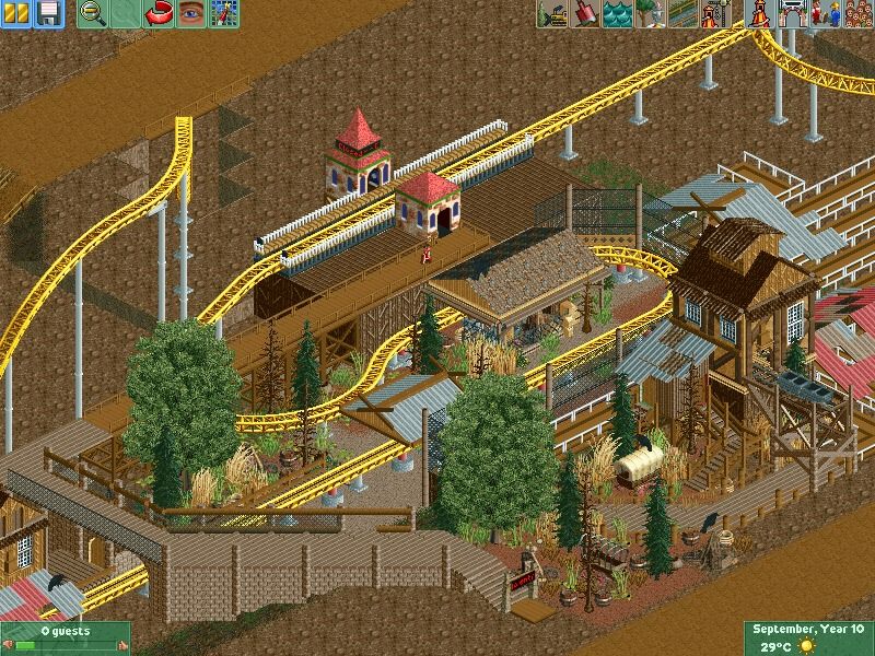
@gijissie1234: Yeah, the foliage needs to go. The coaster and architecture looks good but the foliage is really distracting. -

RMM Offline
it's beyond beautiful. don't change a thing.
it's exactly what overgrown foliage looks like. this whole 'every tree and bush in my park was hand planted' needs to go. am i honestly the only one who's sick of 2 or 3 perfectly placed tress and 5 or 6 perfectly placed bushes under them... perfect clumps of foliage in the middle of nowhere?
although i do think you could do without that tree/giant bush underneath the wooden supports on the right. maybe it's just the angle that makes it appear to be under it. other than that, it's very refreshing. -

 trav
Offline
This isn't real life, this is rct. Rct is meant to look pretty, and you can make it look overgrown and still aesthetically appealing. This does not look aesthetically appealing to me, purely because you have the same bush facing the exact same way in clumps and it just looks odd.
 -

 Pacificoaster
Offline
That exit bridge is very blocky and detracts the eye from the stellar queue themeing. I'd raise the arch way underneath that mine car in the queue a quarter tile. Guests would have to duck underneath that.
 Tags
Tags
- No Tags

