(Archive) Advertising District / Dump-Place
-
 19-April 07
-

 BC(rct2)
Offline
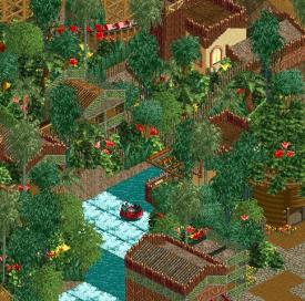
yep, the architecture will be based on Atlantis, the lost city, so the colors will be neutral like white.BC, the problem is is that the support colors is too bright. Anyways the only way I can see this combonation of colors is if the architecture surronding the ride were mostly neutral colored (e.g. tan, peach maybe, white.)
-

 Ruben
Offline
You've definitely stepped up your game. Even though the colors might not be quite perfect yet, the archy is stunning! Keep it up.
-

 imawesome1124
Offline
Coupon: Make some of the trim on those buildings white so they aren't both only one color. That's definitely the best architecture I've ever seen from you.
 -

 Ling
Offline
I really like the monorail track. I would scrap the yellow for a different color though (on some of the flowers)... perhaps a white or purple or something the break up the masses of green.
 -

 wheres_walto
Offline
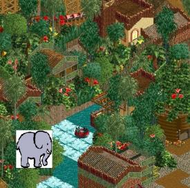
That elephant custom scenery object looks terrible. It doesn't blend with the surroundings at all
 -

 Ling
Offline
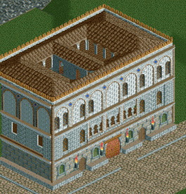
The asymmetrical windows on the top level are more distracting than I thought they'd be when I first noticed them.
Also it reminds me of Ezio's house in ACII. -

 Liampie
Offline
Still trying to get back into park making and such, here's a palazzo:
I'd give it warmer colours, but I like the shape. -

RMM Offline
Just cos there's nobody around doesn't mean he turns into a slut
eh, i mean if hes got his trunk all swinging around while washing his clothes... that's pretty slutty. -

 imawesome1124
Offline
It's not much, and the screen probably isn't up to the standards of NE, but after a year and a half I got RCT2 to work on a Win7 computer. This is just the layout of a wooden coaster for my first serious project, a boardwalk style park.
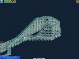
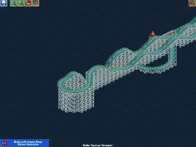
The coaster is heavily inspired by Swamp Fox at Family Kingdom in Myrtle Beach. I know the pre-drop turn is awkward but I had to make it big for it to straighten out at exactly the point I wanted it to.
 Tags
Tags
- No Tags

