(Archive) Advertising District / Dump-Place
-
 19-April 07
-

 disneylandian192
Offline
I really like what you've got, but I echo everyone's comments about the building roofs. Another thing I was thinking is that if this is a Disney inspired park there seems to be a lack of inspiration on that Adventureland sign. Great integration with that souvenir shop though!
 -

 In:Cities
Offline
Thanks guys! Yeah, the roof section isn't final by any means. I'm planning on adding the realistic details, but also some theming for the main ride;]
I'm still working on the Adventureland sign as well man. I was just focusing on the flatride this morning, so I felt like showing it.
Thanks for the great feedback! -

 Turtle
Offline
In:Cities, my main problem with the screen is that while everything's done with skill and presented clearly, there's not enough continuity between textures and materials to really put forward a cohesive theme.
You've got a stone clocktower thing, wooden rooves, tile rooves with metal trim, castle rooves, and brick, all in such a small space. Everything's there, but nothing is really finished to the level where it furthers the theme. It's really hard to describe. It's like the difference between marking out a building's form with blocks, and finishing the building with materials and windows and overhangs and trims and everything else.
Does this make any sense? I think you're one of the most promising builders on the site at the moment, and H2H has clearly given you a massive kick in skill level, but you're lacking the true vision to complete a whole themed area. -

 Xtreme97
Offline
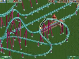
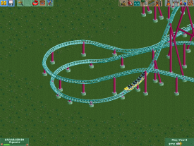
I don't think you should do the supports before the landscaping, since they might have to be changed with the landscape. But I'm a sucker for bright, contrasting colours, so I like the coaster.
 -

 BC(rct2)
Offline
I'm having an handy on the landscape and I trust him, so I think that that will not be a problem, but thanks.
 -

 Ling
Offline
I think all of the supports need to be lowered one space. They're messing with the graphics of the track too much right now.
 -

 Fizzix
Offline
Bold color scheme, but I'm not sure it works(for me). I would go white track with those supports, or a different support color for that track color.
 -

 BC(rct2)
Offline
I will do that Ling.
Fizzix, I like the colors, I think that they work well together, especially for the theme (I guess). -

 Xeccah
Offline
BC, the problem is is that the support colors is too bright. Anyways the only way I can see this combonation of colors is if the architecture surronding the ride were mostly neutral colored (e.g. tan, peach maybe, white.)
 -

 Fizzix
Offline
Coupon, this is what I've always wanted to see from you.
BTW, really nice touch with the vines over the red building. -

 Xeccah
Offline

I haven't played RCT in so long....
...and yet its one of the best things you've made.
but yet looking at it maybe the transition between the red and green is not so good. Maybe you should add a tan building in the middle of thwe two.
or maybe its the textures? i see now that they are different. -

 Liampie
Offline
Why only one colour per building? Why a wooden roof for the red building and steel for the green one?
 -

RMM Offline
good questions.
why only two doors on the green building? why a yellow window for the red building and gray for the green one? -

 AvanineCommuter
Offline
A lot of buildings are actually only one color... although a border in an accent color would help. Overall it looks great coupon!
 Tags
Tags
- No Tags
