(Archive) Advertising District / Dump-Place
-
 19-April 07
-

 Xeccah
Offline
Shotguns, I don't think anyone would think otherwise
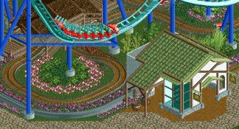
I assume it's supposed to be a park entrance? Could stand to be a bit wider with more lanes. I would make the flowers a softer color too.
Its just a spa, bro, so I do not think many more lanes are needed. but yeah, i'll consider the flower. -

 Cocoa
Offline
why would it be so fat if the coaster goes to the side of it? the idea is that the entrance and exit paths are on both sides of the coaster.
 -

 Liampie
Offline
I think it's a mess, sorry... Codex for codex' sake, uncohesive and generic architecture, and chaotic colours in the foliage mix.
 -

 posix
Offline
I love the effect the supports and jurassic fences create together. Something I've tried a couple of times myself. Also love the yellow fences on the bridge. Some of the foliage is a bit too colourful and undefined, I agree. Also not too sure on those wooden track windows in the brick? Looks pretty strange to me.
 -

 trav
Offline
I think it's a mess, sorry... Codex for codex' sake, uncohesive and generic architecture, and chaotic colours in the foliage mix.
I'll admit this project is just me basically trying Codex out for the first time so a lot of it is indeed 'codex for codex sake'. The chaotic colours in the foliage won't change I'm afraid, as I really like the colours I'm using at the moment. Any reason as to why the archy is uncohesive?
Posix, I'm still learning but I don't know how else to create big windows in brick. Is there a better way of doing it? -

 Ling
Offline
Use golf station pieces, perhaps? And maybe cover them from the outside tile with fences.
 -

 Liampie
Offline
Any reason as to why the archy is uncohesive?
- I don't think those types of brick work together
- Wooden track is gold?
- The lower half of the building consists of four different textures. Two different wood textures, jungle fences and iron roof. Although I don't like the jungle fences there, that's okay so far. But then... the purple track! Horrible colour clash.
- The lower and upper part of the building have nothing in common. Nothing. Couldn't be more different.Is there a better way of doing it?
Straight chairlift track is pretty much invisible. Path works well too. -

 Cocoa
Offline
fix up that foliage/landscaping and it'll be quite good. I think the colors and types of plants are just off.
the entrance building is nice though. -

 posix
Offline
Honestly, I don't think any of the established means to create windows in brick walls look like windows. They look like either path, minigolf or chairlift in a wall, but not like windows. Thus I feel all of the wall textures where ghost trains won't create the little gates have to be used with special care. You usually don't want them on tall "tower" like structures or spires because in real life these things will always have windows, unless you're trying to create something like an obelisk perhaps or so. I think brick is really good for creating smaller surrounding walls or windowless structures like aqueducts (see famous RoB one).
 -

 disneylandian192
Offline
I think a chairlift/path sign combo might get the feel you're looking for. The foliage feels messy, but lush.
 -

 Ruben
Offline
I like it. A lot.
Only thing: Those barrels don't work as lighting. Other than that: wow. -

 Maverix
Offline
AC, when did you get so good? Seriously that is sooo good. Reminds me of the woody from DRC (Nightmare?)
This is my park now...
 Tags
Tags
- No Tags


