(Archive) Advertising District / Dump-Place
-
 19-April 07
-

 BelgianGuy
Offline
It's nice but as you said details are missing a little, try not to postpone that too long as it'll be harder then because you might've been in the zone for another theme,
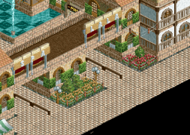
also the path needs some breaking up, maybe use some diagonals and such to get the texture transitions more flowing -

 Maverix
Offline
@Pacificoaster, I mean that layout is ok, but I really think you should consult and expert like mrbuckeye so you can make it better.
 -

 trav
Offline
I:C, it doesn't scream 'Adventureland' at me (Assuming that's what it is from the sign), it looks more like a Spanish village or something.
 -

 Scoop
Online
@Pacificoaster, I mean that layout is ok, but I really think you should consult and expert like mrbuckeye so you can make it better.

-

 Faas
Offline
@Pacificoaster, I mean that layout is ok, but I really think you should consult and expert like mrbuckeye so you can make it better.
That was totally unnecessary. -

 trav
Offline

Any LLers have any idea how I could move the barrels to the overhanging square? Whenever I do, I'm unable to raise the water back to the point it needs to be, even with zero clearances on. -

 Xeccah
Offline
Looks nice Trav and Extreme97!
Pacificoaster I think the layout can be extended just a bit, but it is still fantastic!
HAHA@Pacificoaster, I mean that layout is ok, but I really think you should consult and expert like mrbuckeye so you can make it better.

-

 Cocoa
Offline
yeah like they said, use some simple codex. place a waterlilly on the tile you want the barrel to be and the barrel in the right positioning somewhere else. then drag the barrel onto the water lily in codex and raise it to the height you want.
 -

 Xtreme97
Offline
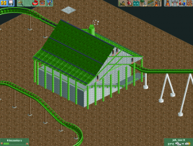
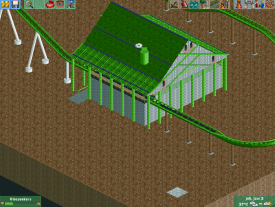
At the moment the structure itself looks quite bare and blocky. Add some more dimensions to it. And I think you should add more colours.
 -

 trav
Offline
Please change the colour of the roof, there's too much green, apart from that, simply just spend more time building. I can see that you're only on Year 2, which is somewhere between 1 hour and 2 hours. To make a station building, layout and some of the custom supports should probably take a bit longer than that, in order to get the detail level right.
 -

 Ling
Offline
Shotguns, I don't think anyone would think otherwise
I assume it's supposed to be a park entrance? Could stand to be a bit wider with more lanes. I would make the flowers a softer color too.
Mika, I'm curious what exactly you're trying to make. A station building, sure, but is it supposed to be a barn or what? The colors are far too offensive, use greens as accents in the surroundings, not a paramount color.
 Tags
Tags
- No Tags


