(Archive) Advertising District / Dump-Place
-
 19-April 07
-

 Gwazi
Offline
lol at Milo and MA, I agree with MA though.
Loopy, that screen is simply gorgeous.
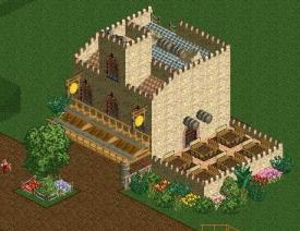
Shotguns, I think you are coming really close to a Spanish atmosphere but falling just short. It feels a tad too empty and open. Might just be the screen angle tough. The archi is very Spanish and fantastic. -

 Maverix
Offline
What's that building even supposed to be and whats the theme? Right now it looks as if you just threw a cover over the start of the lift hill.
 -

 ScOtLaNdS_FiNeSt
Offline
@liampie: Cool, I will think about it
@Jag: There will be peeps in the park of course just not now. There to busy being amused at the entrance.
@cocoa: I dont understand why its pointless ... its a nice little viewing point for the peeps to look over the town square and have food and drink. plus its also how local residents get into there apartments above the shop on the right.
This isnt a park really. Its just a peaceful spanish town with a slow moving river running through the middle on one side and a small "park" on the other. it will be a design
Just to clarify
-

 rct2isboss
Offline
Overall I like it, but the colour scheme could be much better. What I personally dislike 99% of the time, is when a roof has the same colour as the walls of a neighbouring building.
Funny how you say this yet helped build Lijiang. -

 trav
Offline
Funny how you say this yet helped build Lijiang.
Lijiang had white walls and black rooves...? -

 rct2isboss
Offline
Lijiang had white walls and black rooves...?
Just realized I read that wrong. Sorry Liam. -

Felipe// Offline
It's nice, but I think the depot lounge chairs would do it better. Same for the umbrellas, although it's somehow original, it just doesn't look that good.. The building is very cool, colors fit well, just getting those black steel fences at right off and detailing the balconies a bit more. And that white stairs should be brown. The green light posts are really well done! -

 trav
Offline
According to the size of those deck chairs, you'd only be able to fit 3 people laying down in that building meaning that the building would only be like 15ft - 18ft long, the size of an average living room really.
Also, the hot tub would barely fit someone's legs in. (What I assume to be a hot tub anyway)
By that, I mean that either your deck chairs are too big or your building is too small. -

 Fizzix
Offline
I think down-sizing the umbrellas and chairs would be the better solution. Try using 1k Half Planks for towels/chairs, I think that would work better.
 -
 Jaguar
Offline
That screen is very nice MorganFan, but as others have said, the scale is off.
I've never seen umbrellas with two feet thick poles. Those peeps will also be fifteen feet tall that for whatever reason, need towels that are larger and thicker than any normal sized person. For scale in the game, I usually consider a square to be 10ft by 10ft. Don't get my wrong, everything presented is of high quality but unless this park is directed towards giants that like going to the beach, I'd replace those with smaller items. -

 MCI
Offline
@BigB: Hm, I dont like the entrance building that much. To much of the same here.
But I really like the side of the mainstreet you can see on the first pic. Try to add some details there and that should be fine.
The buildings on the second screen are looking rather unfinished. I like the structure of the right one, but both houses need more work...
Gruß
MCI -

Felipe// Offline
@BigB That's a lovely start! Although the path is killing the atmosphere a bit and it's unfinished, I like what I see so far!
@Xtreme97 Cute! Maybe a lake or any other water course behind it would fit perfectly
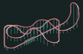
@Pacificoaster Nice, but that hill over the launch area (the first one, counting from the station) is a bit high..
 Tags
Tags
- No Tags
