(Archive) Advertising District / Dump-Place
-
 19-April 07
-

RMM Offline
You make pretty funny posts, MA. For an LL player.
nice.
and as others said trav, round out the mane a bit and you got a winner. and don't worry about making it a mess... it is hair. -
 ScOtLaNdS_FiNeSt
Offline
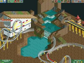
Maybe its a repair vehicle or something because its facing technical difficulties.
 -
 Loopy
Offline
Nice supports Loopy
 btw, what was the purpose of the side friction?
 they look so clean it's difficult not to use them! As S_F said it's supposed to represent the maintenance platform that travels up the lift hill of B&M flyers as the catwalk doesn't fully extend across the length of the track. I thought it would be the best vehicle to use as it is relatively flat and has the square shape required.
-

 ScOtLaNdS_FiNeSt
Offline
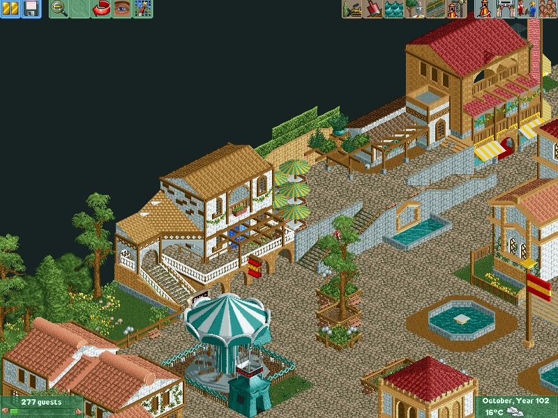
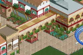
Tis not finished. Trying to create a nice spanish atmosphere
Everybody feel free to comment. -

 Liampie
Offline
Overall I like it, but the colour scheme could be much better. What I personally dislike 99% of the time, is when a roof has the same colour as the walls of a neighbouring building. In this case, the tan roof greatly annots me. If you make it peach it would make the area much more coherent. The swing mill's and the parasols' colours look weird as well. Dark red for both the swing mill and the parasols, try it. Cohesion is the key to a good atmosphere.
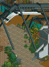
Raven is currently experiencing technical difficulties. The ride will re-open shortly.
Looks great.
Great. -
 Jaguar
Offline
That screen is nice but when I think of a Spanish atmosphere, I imagine something bright and warm. The architecture and foliage here is nice, but it feels cold and dull. I would replace that crazy paving with some sort of tile pathway ans give the umbrellas a brighter color. The atmosphere of the park would be so much livelier if peeps were in the park as well.
I'd also say something about the swing ride, but it seems to be unfinished. Other than that, it is a decent park, it just feels a bit dead. -

 Cocoa
Offline
the elevation changes seem rather pointless IMO. make the landscaping be a part of the park, not just an obstacle or something to vary up a boring bit of path.
 -

 Jaguar
Offline
I guess it isn't NCSO but the path is in LL, so you can consider it. There needs to be a category for parks that aren't exactly NCSO but are very close with only a few custom objects (like those parks from 2003-2005 that only contain things like shake roofs and paths).
The screens themselves are nice but I feel there is too much texture clash. My guess is that you were going for a Mediterranean theme. The buildings shouldn't be so mixed. I see wood, stucco, brick, and concrete and one building. -

 MikaRCT2
Offline
The building on the left needs some more textures, right now it's just a big block with some different colors. It also looks kinda messy IMO.
 Tags
Tags
- No Tags


