(Archive) Advertising District / Dump-Place
-
 19-April 07
-

 Louis!
Offline
^I was inspired by the Olypmic Stadium but it's not really Olympic related, just fancied building a stadium and no one here has ever attempted a circular style stadium, so I thought I would. Hopefully it will develop into some sort of sports complex like the olympic complexes but we shall see.
The athletics track is something I want to keep as again no one has done it before, not properly, but if it becomes too difficult I guess it will just end up being something else. Unless someone wants to make objects. -

 Sulakke
Online
That second idea is cool. Not really liking the first, the idea is not that bad, but it's looking ugly because of the different track types.
 -

 Six Frags
Offline
Ouch, well, good luck with it dude. Nice to see you building in rct2 tho.The athletics track is something I want to keep as again no one has done it before, not properly
-

 Louis!
Offline
Ouch, well, good luck with it dude. Nice to see you building in rct2 tho.
I meant as in no ones done it full size lol, the hurricanes did it well
-

 Scoop
Offline
hey all ok get ready for a really long post.
Chrixz-I like the ideas that you have portrayed, however it is just to repetative. especially with the windows on all of the buildings. keep at though.
Also remember that screen from my park thread.
yeah this one.
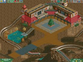
well I have decided to actually use it and this is what i have expounded upon. I hope you like it and please bring on the comments.Boy are you guys right im doing great now just because i have taken my time. Just look at this. it is so much better than what i had previously done.
thanks again everyone for the motivation to try harder.
obviously it is unfinished. -

 Maverix
Offline
Kong is the expert on the 'brown' style. You should probably ask him what he thinks.
 -

 Ling
Offline
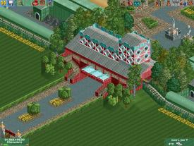
Decent start, mrbuckeye, but little things like continuing the pillars up through the arches (perhaps on the same face on the adjacent tile) or giving the arch details on the side of the building some extra essence would help. The majority of the screen is unfinished so it's hard to say anything else. I think you should consider your roof layouts as well, and how they would actually look from ground level. Compare to other (ideally real) buildings.
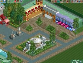
Chrixz, I like the screens, but the overhangs and such in the second screen could use some supporting. Also I would try to dress up the entrance and exit huts somehow. -

 BC(rct2)
Offline
You are getting progress mrbuckeye! but the roofs are not in the right place/not well collocated.
 -

 FK+Coastermind
Offline
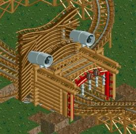
Didn't u hate on all my sculptures in Monstrocity, and here we are, a woodie going into a lions mouth! Lol, jk, I like it, but agree, it is very angular, needs more curves and maybe use some trees or bushes to make the mane seem fury, instead of smooth.
FK -

 Midnight Aurora
Offline
I want to scream anytime anyone says something like this. We, the players who favor LL, thank you for your pity.Really nice for LL.
 Tags
Tags
- No Tags


