(Archive) Advertising District / Dump-Place
-
 19-April 07
-

 Neropegasus
Offline
Holy cow fizzix and enigma - you're amazing! Your work is definitely inspirational.
Alright, this is from Marley Point, but I have no intention of reviving the thread. I have a tendency to abandon it soon after I post...also because it's been half a year.
What to do with these?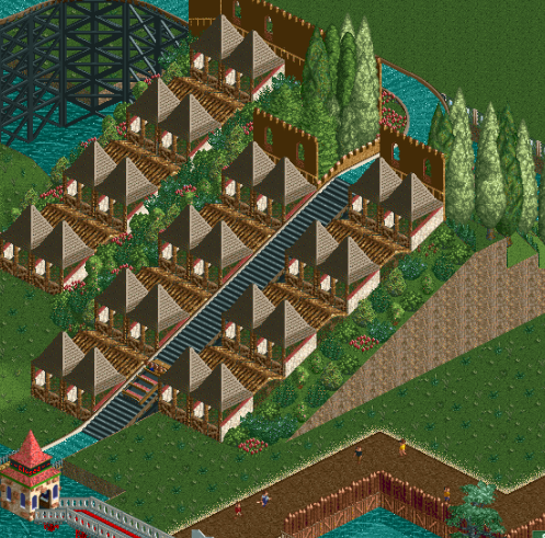
-

 Hex
Offline
Fizzix: Clean and well executed. Nice work.
enigma: Different style. I like it. Continue!
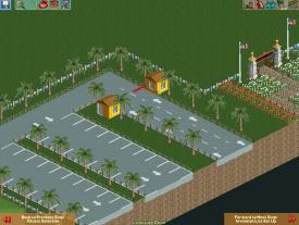
Nero: Never use that pointy roof more than like 2 times on a building. All of them next to each other looks horrid. There's not much to comment on the screens other than that. I also don't care for the landscaping in the second screen.
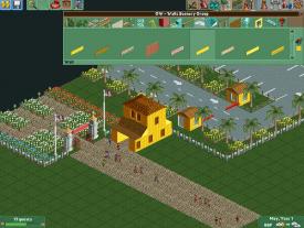
This area in my new project is for me to improve on atmosphere, foliage, and overall 'life' in the game. How's it look? -

 Dr_Dude
Offline
Who's that?
Broooooowwwwn!
Also the foliage on the walls of the building of the left don't really work as vines/etc. and I'm having trouble seeing them as anything else. -

 AvanineCommuter
Offline
In my opinion there are a lot of talented builders who don't seem to understand how to get creative with the composition of their park; technically amazing, but lacking in creativity/atmosphere. What make certain parks fantastic even if it's technically not the best is what you've shown in that screen; there is such great interaction between everything in that screen enigma. That is something I'm always trying to do in my parks and you've got it down pat.
 -

 trav
Offline
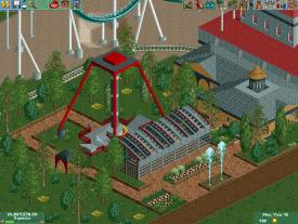
Definitely not a bad first attempt. I don't like the thickness of the arm that swings though, and I don't like the platform at the top. I like the use of the tiled roof as the lowered floor though.
 -

 MikaRCT2
Offline
Thank you trav! I made that lowered floor
 I helped him. I only did the hacking and the floor though.
-

 Camcorder22
Offline
You basically have the same building six times but in different colors. Definitely have to mix that up a little bit if you want it to be interesting.
 -

 RWE
Offline
MCI built something in CSO?
For somebody who normally build NCSO it isnt bad I think. But there is nothing that is really good.
Try to build with more differences in your roofs and in the position of your buildings.
mfg. RWE -

 Ling
Offline
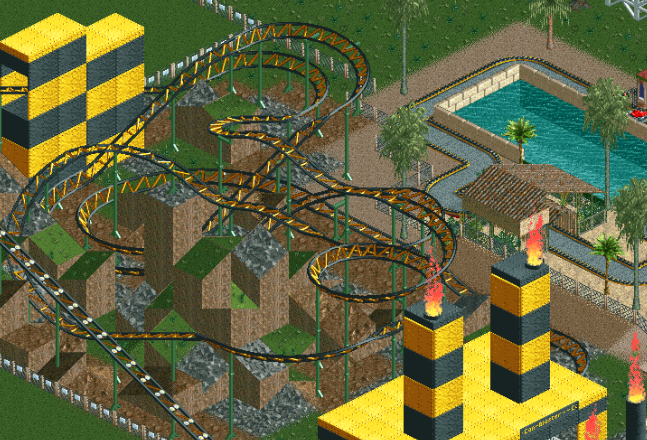
@ molemaster: The structures don't make much sense. I'm not sure what they're supposed to be, and the only clue is their location, not their form. The colors are also a little loud.
@ hulkpower: I'm not a huge fan of that path type (or the way the picture is cropped...), and it's still an extremely grey mass of brick... but there's definitely a lot of work shown there, and I quite like the form. Looking forward to seeing how you integrate it. One thing though, what's up with the quarter-tile ice blocks randomly on the bridge? -

 Xeccah
Offline
The Gray actually works with the atmosphere in this, hulkpower, because it is so (literally) cool.
I'd say to add more dark foliage.
 Tags
Tags
- No Tags


