(Archive) Advertising District / Dump-Place
-
 19-April 07
-

 Ling
Offline
You have an eye for small-scale building that I will never understand, robbie.
Suicide, that's alright... bit empty. needs some rapids of some kind in there.
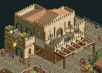
RCT2day, I like the atmosphere, but it does feel a bit empty without the surroundings - either other buildings or more dense foliage. I'm not sure the jungle trees fit. -

Felipe// Offline
Suicide Cars - I agree w/ Ling and I'd also say to use less land textures, maybe the red rock should be changed.
Robbie - you're nasty!
-

RMM Offline
gijssie builds small scale and is raped. robbie builds small scale and he is king.
huh.
it's definitely nice, though. -

 FK+Coastermind
Offline
the problem was never scale. Gijssie, and robbie sometimes, only builds in one theme, a self-aware "i'm building a theme park" theme. There is no distinction between areas, so while all beautiful, it seems bland. Once Gijssie moves into creative theming, he will become legend.
FK -

 chorkiel
Offline
Once Gijssie moves into creative theming, he will hit the object limit.
Fixed it.
In all seriousness, robbie's small scale buildings are way cleaner than gijssie's. But robbie is more experienced than Gijssie so maybe in a few years gijssie will have his own spotlight. -

 Turtle
Offline
Incredible, robbie. Really don't like the brown diagonal crosses on the path though. Perspective is off.
 -

 J K
Offline
I think the first stages of this are good, the stuff you add around the section will take it up a notch for me.
 -

 Steve
Offline
I think Rob is cheating somehow. There's no way anyone can be this good at a game. I agree with Turtle, though!
 -

 tyandor
Offline

I like it a lot, but I have an issue with this screen. I don't know what the vibe should be for this area, but it seems a bit too 'cold' for my taste. Then again, I don't know if that's because of I don't see the entire area, but tbh I think a more 'tropical' approach would do wonders for this area. For starters I recommend trees with a deeper shade of color (the big ones kill it for me) or maybe some flowers or something. It's missing something like that while this could easily be close to perfect. -

 JKay
Offline
interesting buildings. but feels more like an upscale tourist-y area rather than a theme park. needs green stuff
 -

 Brent
Offline
interesting buildings. but feels more like an upscale tourist-y area rather than a theme park. needs green stuff
You DO know what this is based off of, right? -

 Ling
Offline
Fizzix, since it's so small I can't say much for the atmosphere, but there are a lot of good ideas there. I think the Roman wall texture is a little out of place (especially because it looks like there's only that one), but the use of the wooden entrances and the gong as a hanging sign is genius.
 Tags
Tags
- No Tags


