(Archive) Advertising District / Dump-Place
-
 19-April 07
-
 ScOtLaNdS_FiNeSt
Offline
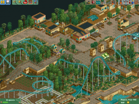
You sure there is no WW/TT ... Im pretty sure the roof you are using over the entrance building is exactly that.
 -

 Gwazi
Offline
Realistic movement was going a while before WWAP. That was just the catalyst for the virtual death of pretty much every other style. Great park, but I get so bored of seeing all the generic realistic parks spawned from the movement since then.Please, no more Six Flags projects people! It's getting seriously old. It's just getting so boring to view basically the same thing over and over. mrbuckeye, if I were you, I'd build a small park off of that, not necessarily Six Flags. Just a small park. Seriously people, no more Six Flags, please.
Sorry that this happened after your post, mrbuckeye, I just needed to get that out there for everybody. You can build realistically without branding it, take a look at Watkin's Woods, the park that for the most part, started this realistic movement. Not a real brand. Again, sorry if I seem anal of dickish(didn't mean to use those two so close, lol), but it just bothers me that so many people build the same thing so often.
mrbuckeye, I like what's there, although roofs in that shape(the green ones) are very awkward. I would at least change those. Otherwise, it's nice.
That's WW/TT scenery isn't it? Bad idea... -

 Ling
Offline
If you build a park with any WW/TT very few people are going to look at it, and as a general rule the quality is going to be much, much lower. WW/TT just can't look as good as original RCT2 or CSO. You use too many different types of flowers, the textures don't mesh, and I don't think that support system would actually hold the coaster up. One beam should be a direct path to the ground. I like the park fence. Stick to just one fountain in the center.
 -

 Faas
Offline
Try to make the red things above the entrances yourself, out of deco pieces. It's more work but it would look ten times better. Try to make the fountains and the water more interesting. Use different shapes and smaller objects. Dont't be too lazy when you're doing architecture.
 -

 Ling
Offline
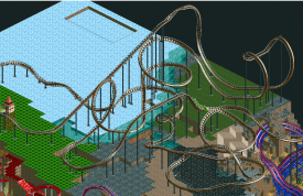
A black lake. I'm sure that narrows it right down in the genre of metal.
I think the first half of the layout is brilliant. But the second half is very... meandering. Twists and turns for twists' and turns' sake. Also I'm not a fan of a barrel roll at the bottom of a hill (end of the ride). I'd cut out the big almost heart-shaped thing in the middle and do two quick corkscrews to the end. Unless of course the black lake thing is a major part of the ride, in which case... Idk, still not really a fan of the way it works. But I have to say again I really love the first half. -

 Camcorder22
Offline
No, although I forgot they had that song and that would be a sick idea. This park was for more mainstream metal though and I honestly don't know if I could do the atmosphere of Agalloch justice.
 -
 Dr_Dude
Offline
I don't listen to Opeth but I thought Opeth when I saw the screen. That can only be good, I think.
 -

 Camcorder22
Offline
Opeth has a very distinct atmosphere and color scheme, one of the reasons I picked them, along with them generally being the shit. Hopefully it will look MORE like Opeth when its finished lol. Also Ling, I ended up trying out what you said and it was a lot better. I actually needed that lakeside where the track was originally to build something.
 -

RMM Offline
Oh god I hate cropping like that.
oh no fucking kidding. i don't get how grass looks worse than a whited-out cropping. we all know what isn't there. big deal. just show the pic the way it is.
if it bothers you so much to where you feel you must crop out unfinished parts, why not just finish it or post it as is?
meh. -

 A.S.Coasters
Offline
I agree, but there could be something there that he doesn't want to show. Thus creating a reason for it.
 -

RMM Offline
I agree, but there could be something there that he doesn't want to show. Thus creating a reason for it.
but there isn't.
 Tags
Tags
- No Tags


