(Archive) Advertising District / Dump-Place
-
 19-April 07
-

 Xeccah
Offline
That actually looks really good. It has an almost RoB feel to it.
Holy fuck, that is what I was trying for( but of course to stay unique). -

 Scoop
Offline
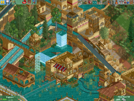
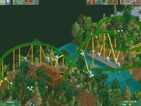
Here's a little teaser screenshot of my new park.
This is a log flume navigating through a ruined palace
Remember, its ruined, so its supposed to look a bit messy.
our new park im doing some of the layouts. -

 posix
Offline
Yes, very good. The waterfall is perhaps slightly unrealistic going from terrace to terrace like that.
 -

 Fizzix
Offline
Having wood support stone is one of my pet peeves, not sure if that's reason enough to change it though. Looking great otherwise.
 -

 Xeccah
Offline
Having wood support stone is one of my pet peeves, not sure if that's reason enough to change it though. Looking great otherwise.
I'm playing for myself. Wether or not is goes well when I release the finished park to the site I do not care ( though I do hope it will fare fairly well). -

 JJayMForce
Offline
Nice job Shotguns? It reminds me of Atlantis, would love to see you do that theme. At first I thought it looked a little sloppy, but with a closer look, not at all!
 -

 Fizzix
Offline
I realize you're playing for yourself, just thought any feedback would help. Didn't know if I was the only one with that opinion either.
 -

 Ruben
Offline
I kinda agree with Fizzix, and I think your reaction to the post is rather foolish. If you're not into at least considering critique, then why show?
Otherwise, I have to say it is pretty interesting stuff. It's a bit rough around the edges, and a tad unrefined, but the concept is very cool and the feeling is definitely there. Please just listen to comments when they can make your work better, not only for us, but for yourself as well.
-

 Xeccah
Offline
I kinda agree with Fizzix, and I think your reaction to the post is rather foolish. If you're not into at least considering critique, then why show?
Otherwise, I have to say it is pretty interesting stuff. It's a bit rough around the edges, and a tad unrefined, but the concept is very cool and the feeling is definitely there. Please just listen to comments when they can make your work better, not only for us, but for yourself as well.
Look, I am not saying that I do not give a damn about your thoughts, but when I like something on my park that others do not, I will not change it very much. Though I do agree with posix's critisism about the waterfall.
As I said, this is not meant to look 'clean', and therefore may not look really refined. Also, I am not using much quarter tile blocks here so that may be the reason as well.
But thank you, and I am sorry if I came off like a dick. -

 Camcorder22
Offline
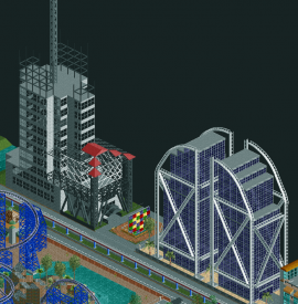
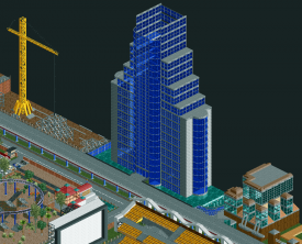
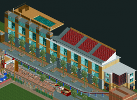
7 years in and I finally hit the object limit...these buildings will be the first to go, RIP.
The object selection is obviously dated and so is the appearance of the park...hate it if you wish.
If anyone wants to throw down a building in this park or otherwise help me finish it, let me know. I need a fresh perspective on it. -

 Xeccah
Offline
7 years in and I finally hit the object limit...these skyscrapers will obviously be the first to go, RIP.
isin't this your 200*200 park? -

 Ling
Offline
Colors could use some work, and you need way more rapids pieces. But on the whole, you've improved alarmingly fast.
 -

 Camcorder22
Offline
isin't this your 200*200 park?
Surprised such a new member would even know about it. But yeah this is it...you think it would've been fairly obvious not to build a ton of tall shit, but guess I had to learn the hard way lol. -

 Xeccah
Offline
Surprised such a new member would even know about it. But yeah this is it...you think it would've been fairly obvious not to build a ton of tall shit, but guess I had to learn the hard way lol.
The object limits a bitch. -

 Gwazi
Offline
Reading this thread backwards, I saw Shotguns' last screen and said "hey looks like RoB," and then I read earlier and saw that other people had already posted that. It's pretty cool stuff. Love the flume's interactions with itself and scenery.
 -
 RCT2day
Offline
Shotguns?: Really great screen, one of the best I've seen in a while. But agree with Fizzix's feedback (but do whatever you think is right and have fun with it)
Camcorder: Nice buildings, but you've already reached the object limit? That's amazing
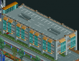
Here's another screen I've been working on (there is a purpose to the dirt paths below it and across the bridge): -

 Xeccah
Offline
Having wood support stone is one of my pet peeves, not sure if that's reason enough to change it though. Looking great otherwise.
Its supposed to be ruined so in most places that is meant to be the framework.
But wow, I did not expect this positivity out of that screen nor did I expect people to immedately think RoB even though I viewed it a good times when I built the flume. Hopefully no one thinks I am copying even though it is strongly inspired by RoB -

 A.S.Coasters
Offline
I uninstalled WW&TT (yes I checked, all of their objects are gone), and started my next project. I would like to get a higher score than my last ride, so point out anything you don't like.
This is also my first successful entrance/exit hack.
Paths and track are still unsupported, train colors are not final and station will receive more detail.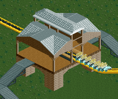
 Tags
Tags
- No Tags

