(Archive) Advertising District / Dump-Place
-
 19-April 07
-
 Corkscrewy
Offline
Not entirely sure what I'm looking at.. But I like it man!! Great first post.
Corkscrewy
Offline
Not entirely sure what I'm looking at.. But I like it man!! Great first post.
-Josh -
 highroll3r
Offline
loopy: that oozes atmosphere i really like it. im not into LL but this is proof why the game is still alive. well done.
highroll3r
Offline
loopy: that oozes atmosphere i really like it. im not into LL but this is proof why the game is still alive. well done.
keane: thats a good start. maybe you could add some more ground floor windows and a door.
id also try to get anoter colour in there. -
 leonidas
Offline
Even dispite paint screwing up the colors, the colors still don't match. The purple with the brown..
leonidas
Offline
Even dispite paint screwing up the colors, the colors still don't match. The purple with the brown..
Maybe change the wood into that more grey-ish brown?
The architecture is great though, I like the atmosphere! -
 trav
Offline
Not meaning this in a disrespectful way, but where in England have you seen a dark purple building next to a red building next to a teal building? Or anything similar to that?
trav
Offline
Not meaning this in a disrespectful way, but where in England have you seen a dark purple building next to a red building next to a teal building? Or anything similar to that? -
 Pacificoaster
Offline
All three of those buildings follow the same structure that creates a redundancy. You have blocky buildings, with brown deco trim, and black roofs.
Pacificoaster
Offline
All three of those buildings follow the same structure that creates a redundancy. You have blocky buildings, with brown deco trim, and black roofs. -
 Dark_Horse
Offline
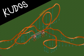
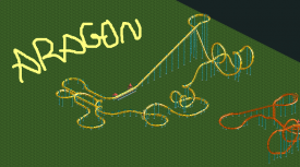
Kudos is decent. Aragon is kinda meh IMO. Your biggest weakness in these layouts is putting turns at the bottom of hills. Also, think about what the purpose of certain elements are. Take the second cobra roll of Aragon for example. Normally, cobras are used to send the coaster in the opposite direction (back towards where it came from). But, you have a u-turn right after your cobra roll. I think a sea serpent would fit here much better. If you're up for it, take a look at RCDB to see how real coasters are built, paying attention to order of elements and their purpose. Once you can identify that, try to emulate it in RCT. Good luck.
Dark_Horse
Offline
Kudos is decent. Aragon is kinda meh IMO. Your biggest weakness in these layouts is putting turns at the bottom of hills. Also, think about what the purpose of certain elements are. Take the second cobra roll of Aragon for example. Normally, cobras are used to send the coaster in the opposite direction (back towards where it came from). But, you have a u-turn right after your cobra roll. I think a sea serpent would fit here much better. If you're up for it, take a look at RCDB to see how real coasters are built, paying attention to order of elements and their purpose. Once you can identify that, try to emulate it in RCT. Good luck. -
 MorganFan
Online
MorganFan
Online
If you're up for it, take a look at RCDB to see how real coasters are built
Definitely do this. There is no "If you're up for it." This is a must.
I'm sorry, but I have no idea how kudos even gets over the loop. If it does, it probably at most goes 5k/h.
To be blunt, don't try to be innovative in the sense of creating a whole new type of coaster, but innovate an existing design.
They will get better. -
 Lloyd
Offline
Lloyd
Offline
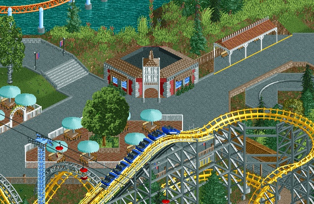
First thing i thought when i saw it, looks like Metro doing Tussauds...it remind me of something tussauds would do.


Tags
- No Tags