(Archive) Advertising District / Dump-Place
-
 19-April 07
-

 robbie92
Offline
I prefer pre-Haussmann Paris.

Ugh, Haussmannian-era architecture is incredible. I wouldn't love Paris nearly as much without it. It separates Paris from the rest, in my opinion. If the Haussmann blocks didn't exist, Paris would look like practically any other rich medieval city. Plus, I find the style to be a fairly-natural progression from the French Baroque and classicism of later additions to the Louvre and other 17th/18th century additions.
Liam, it seems as if you and I will never agree on architecture and urbanism... haha -

 In:Cities
Offline
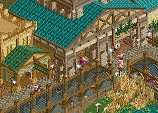
Shotguns you're really getting quite good. Although I still wish you would complete more before you show us!
Just continue on with this theme, get a substantial amount done, stop worrying so much about what we thing and build what YOU want:] -

 Cocoa
Offline
If you make it new orleans, shotgun, then that will be nice. That screams New Orleans to me. Which is french, so good job, I guess
 -

 Xeccah
Offline
If you make it new orleans, shotgun, then that will be nice. That screams New Orleans to me. Which is french, so good job, I guess
Funny thing is is that I live an hour within new orleans -

 Cocoa
Offline
I don't like the colors on the left building, but its good otherwise. yellow windows on tan is never interesting, try purple with brown frames or something. and the green roof needs to go, maybe a tan or red roof would be better? also, slope it differently, as right now it is the same as the building on the right and looks a bit awkward.
 -

 BelgianGuy
Offline
I actually like it a lot, it's something different, red or purple would make it too standard, I say keep it as is
 -

 Dimi
Offline
Wow you've improved, that looks awesome Fizzix, I love those columns! Interesting shapes and the right amount of details. I think the colours are fine. Can't wait to see moire of this!
 -

 posix
Offline
Wow, you can still make buildings without stacked walls! I think it's wonderful.

pierrot, I fail to find jurassic fence in the screen?
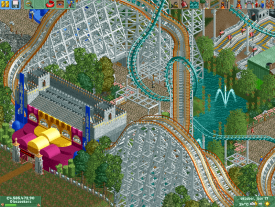
Love the composition you have there. Afraid the barrels will never work for me but oh well. What you did with the Virginia Reel looks interesting. What is it? -

 Ruben
Offline
It's really subtle, used in the roof right behind the two signs.
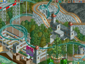
Nice, solid work. Nice trackitecture in the top of the screen.
-

 Loopy
Offline
Cheers guys. The Virginia Reel is supposed to represent the concrete sides of the Stingray touch tank.
 Tags
Tags
- No Tags


