(Archive) Advertising District / Dump-Place
-
 19-April 07
-

 ScOtLaNdS_FiNeSt
Offline
@ruben: Yeah tell me about it
 Just got a bit rusty. This is just a small rest point for people so it doesn't need to be special, Its tarmac its just that the dividers are local "scots pine" that have been cut down and placed there whats unusual about that. Yes 7 parking places might add 4 more but once this is done and you know the location of this you will understand that its not the busiest place in the world and wouldn't need alot of parking. The building is part restpoint/toll station.
This will get better my mind is just a bit tired after getting up at 3am dubai time and sitting on a plane for 7 hours. -

 Fizzix
Offline
I think you'd be better off with some kind of tile roof instead of wooden. I like the center building, but not the right, it doesn't have very interesting form.
 -

 Xeccah
Offline
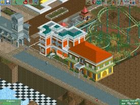
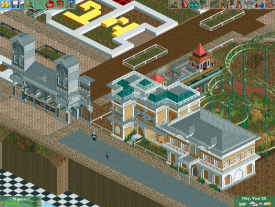
Center building: 2 hours to correctly make
Right building: 10 mins.
Trav, Its more French inspired than anything, but there Is not many well exectued examples of French architecture in RCT, except Mont saint michel and a few others.
Fizzix, I know I need to change it up from simply rectangle.
But do the colors work? -

 ScOtLaNdS_FiNeSt
Offline
Just look on google, Im no genius but im sure there are plenty of pics of french architecture taking by french people in france lol
 I agree with fizzix.
Improved so much though
-

 Fizzix
Offline
Yes on the proper building, no on the square one. I'd pick two of the four you have on the square one, and use those. You don;t have to use RCT architecture to base your's off of, just use real architecture.
 -

 trav
Offline
Trav, Its more French inspired than anything, but there Is not many well exectued examples of French architecture in RCT, except Mont saint michel and a few others.
...But it doesn't look like any part of France?
Paris (Central France):
Link 1
Link 2
Marseille (Southern France):
Link 1
Link 2
La Rochelle (Eastern France):
Link 1
Link 2
Rennes (Northern France):
Link 1
Link 2
Chambery (Western France):
Link 1
Link 2 -

 trav
Offline
1. They're completely different architectural styles.
2. I'm sorry but it doesn't look like either of them.
I'd suggest calm down with the colours. If you want Parisian architecture then try using browns, greys, whites, even if it looks boring it'll look the most like Paris. If you want the typical Western France/Swiss/Southern German architecture then use more pastel colours rather than the deeper colours. For example instead of the dark orange, use the peachy colour between the brown and the red on the bottom row. Also, don't use that many colours on one building. Get rid of the blue roofs as well.
The architecture also needs to be a lot more detailed if it's Parisian.
I have to admit I do like the grey bit of architecture on the left though, that looks like it'll be quite nice if you keep up that level of detail. -

 Dimi
Offline
Trav is right. There is no such thing as 'French architecture' in general, you have to decide what theme you're exactly going for. That being said, it's a good thing that you're willing to do a theme instead of just something generic. Despite the lack of a clear theme the buildings are pretty good btw. One major advice: don't design your park-layout by making big, straight, wide paths and then fill up the sides with buildings. You'll lose motivation quickly. Try to make everything flow and blend together with well-thought curves and little plazas, try to create some cohesion, imagine yourself being there.
 -

 trav
Offline
That just looks like Ye Olde England. Bit boring.
I love the super-detailed architecture of like Paris, London and I'm sure many other capitals around Europe. It's just so extravagant and looks so nice. -

 leonidas
Offline
I love both.
If you want what most people recognize as typically french, I think you should go with the 19/20th century Parisian style of architecture. -

 Liampie
Offline
I love the super-detailed architecture of like Paris, London and I'm sure many other capitals around Europe. It's just so extravagant and looks so nice.
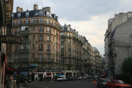
Paris, super-detailed? It's the same building copy pasted endlessly over a huge area. And even details from rare older buildings covered by plaster so they blend in.
I easily prefer pre-Haussmann Paris. Not even necessarily the Medieval Paris. Much more organic and alive. Not as clinical and boring. New sights to see everytime you turn around a corner.
I'm not saying that my opinion is better than yours, but you simply cannot like modern Paris more because it is 'super-detailed', while it is nothing compared to what it was before the bulldozer party.
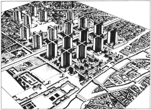
I think I had a similar discussion before on NE. I just can't get over how sad the 19th century renewal of Paris is. Not denying that the new Paris has its qualities, but still. It's like removing every building from Manhattan and replacing it by ten huge commieblocks.
Well, at least Le Corbusier didn't have his plan executed:
I hate him anyway.
-

 leonidas
Offline
Agreed.. Honestly, I think most of the city renewals after the 20's have been a dramatic loss of heritage, atmosphere and beauty. Paris has had it's "make-over" well before that. Though, despite the ugly corner apartments etc, it did deliver some of Paris' monumental centers and plazas.
 Tags
Tags
- No Tags


