(Archive) Advertising District / Dump-Place
-
 19-April 07
-

 trav
Offline
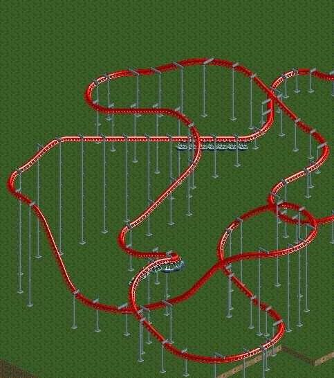
It's much more realistic. The only other thing would be to change the train to the Vekoma SLC trains too. But yeah, it's your park so your call.
 -

 ivo
Offline
I think it was even posted here on ne. It was posted by a french user called Sûre. But I think he was active with different acounts on both ne and rct space.I SWEAR I've seen that on RCTspace.. can't remember for the life of me the name of the user that posted it.. Your style looks similar to theirs, though. Have you posted that screen before?
Good to see you back! -

 BC(rct2)
Offline
FINAL DECISION!
it's more realistic like trav said and it looks nice so we chose this one!
-

 Fizzix
Offline
You made the right choice. Now just rebuild the tops of the supports with zero clearances on so that you're supports actually touch the track.
 -

 Pacificoaster
Offline
You spam the Dump Place, with essentially the same picture of a recreated layout, when you could have easily checked out Six Flags Carolina or simply looked at RCDB for what one of the many standard Vekoma SLC's in world look like. Oh and for the record, the trains that are currently on there are for Giant Inverted Boomerangs. If you're going for realism you may want to change that to the two seater design.
 -

 Xeccah
Offline
You spam the Dump Place, with essentially the same picture of a recreated layout, when you could have easily checked out Six Flags Carolina or simply looked at RCDB for what one of the many standard Vekoma SLC's in world look like. Oh and for the record, the trains that are currently on there are for Giant Inverted Boomerangs. If you're going for realism you may want to change that to the two seater design.
Newer people need more help, thus more screens. After this project, you'll see him post less screens most likely. -

 Ling
Offline
With such a limited array of elements, suspended coasters are kind of all about the surroundings. So you need to put it in context first.
Also I may or may not be working on a suspended design right now.
That hopefully will be the first one since Marshy's seven years ago. -

 Brent
Offline
The first rule of RCT is: You don't build coasters at level ground.
The second rule of RCT is: YOU DON'T BUILD COASTERS AT GROUND LEVEL.

-

 Dark_Horse
Offline
BBW was 100 ft tall with a 80 ft drop. I think it's fine. Right now, it seems like an okay layout, but as Ling said, the surroundings are going to make it or break it.I think its too tall for a suspended.
-

 BC(rct2)
Offline
I spam the dump place?? I just asked people to see witch more is realistic, to help us (me and mika) just that! Oh and for the record, why don't you said the part of the trains before?? we just wanted to be original in using the giant inverted boomerang cars...but okYou spam the Dump Place, with essentially the same picture of a recreated layout, when you could have easily checked out Six Flags Carolina or simply looked at RCDB for what one of the many standard Vekoma SLC's in world look like. Oh and for the record, the trains that are currently on there are for Giant Inverted Boomerangs. If you're going for realism you may want to change that to the two seater design.
-

 Liampie
Offline
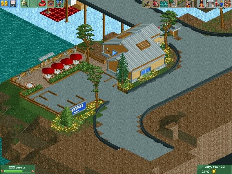
That's pretty nice, I love the binoculars. Good idea.
The monorail looks shit though. Sorry. I doubt you actually need such high fences along the road and they're just way too glitchy to look good. -

 verti
Offline
I spam the dump place??
Wouldn't even be as bad if it wasn't for that terrible signature. -

 ScOtLaNdS_FiNeSt
Offline
^^ lol
@liampie. Yeah cheers the monorail, i was going for the thick barriers you get next to motorways and stuff. maybe try the horse ride as a barrier something along those lines. This is for a project i just started today so its more just experimenting just now, it will be a nice little viewpoint once the area is finished Just getting back into the swing of things haven't played for a few weeks.
-

 BC(rct2)
Offline
well I respect your opinion...but I will not change it for any reason in the world, don't like it? it's lifeWouldn't even be as bad if it wasn't for that terrible signature.

and this is dump place, is not chat
EDIT: but wait...you don't deserve to see her beautiful face so I will put her name...she is my idol, what's the problem? I like Linkin Park too if that makes the "spam" get out of here
-

 Xeccah
Offline
^^ lol
@liampie. Yeah cheers the monorail, i was going for the thick barriers you get next to motorways and stuff. maybe try the horse ride as a barrier something along those lines. This is for a project i just started today so its more just experimenting just now, it will be a nice little viewpoint once the area is finished Just getting back into the swing of things haven't played for a few weeks.
The steeplechase track would look more realistic anyways. -

 Ruben
Offline
@BC: Grow up. Just saying. You were kinda right about pacifi's post, but what comes after it is just blabla. And the sig ís kinda screamish right now, can't you just use black lettering in a normal size? It does look a bit trashy you know...
@Scotlands_finest: You've shown better stuff lately. It's pretty okay, some details like the binoculars are fun, but overall I think you can do better. The building is fine, nothing special, but fine, but the parking lot really needs some work. If you use logs as dividers, chances are rather big that the ground isn't tarmac (at least in my experience) but some sort of dirt/gravel/cobbles instead. Furthermore there is a grand total of 7 parking spots a.t.m, what just doesn't feel very realistic.
 Tags
Tags
- No Tags

