(Archive) Advertising District / Dump-Place
-
 19-April 07
-

 MorganFan
Offline
I really question the long flat bits on the coaster. Just seems unrealistic and unnecessary.
Have you ever seen an Arrow in real life? -

 Ling
Offline
Of course, but looking at the screen, going into that tunnel means it either dives or there are at least another 2~3 straight flat pieces under that structure/mountain. It just seems kind of like "Oh, I want it to go into that tunnel, but my design is too far, I'll just add a bunch of straight sections cause it's easy." Also, why does the lead-in to the lift have to be three tiles long? The archy is a fine, if a little random, I just don't like how it's all absolutely brown. I know it's one of the best-looking colors in RCT but you still have to try to mix it up.
 -

 Ling
Offline
More detail and maybe one more color combination and I think it would look really nice. Plus continuing the quarter-tile landscaping into the pit, of course.
 -

 Liampie
Offline
Colours and textures are not optimal, but I think you figure that out yourself since you're not exactly unexperienced. Just rusty, like you said. The composition is very nice.
-

 Ling
Offline
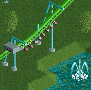
I would make the color of the flange connecting to the footer either the same as the support or the same as the footer. The control box is a little large. The vertical beam at the back needs a flange on the footer, and I think it needs a catwalk
-

 Xeccah
Offline
Don't expect any more screens after this. I don't want to reveal anymore than this,
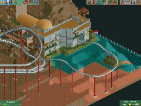
OK. so I have imporoved on the castle which I am not done with. You can also see a glimpse into the theme through one tiny detail on the castle.
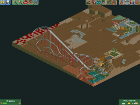
I felt that Arrow dynamics looper I had was shit, so i canned it and went with a schwarzkoph
Thanks for the criticism! -

 Fizzix
Offline
Is there any reason you're using water tiles instead of actual water? Are you going to build something beneath the water?
 -

 BC(rct2)
Offline
Just to show a little thing
on a project that me and Mika are working!
Hope that you like it! -

 RWE
Offline
Just to show a little thing on a project that me and Mika are working!Hope that you like it!
All in All it looks good. But I don´t like the supports. I think there are to much.
But the layout is good.
-

 BC(rct2)
Offline
thank you! the layout is a recreation of El Jáguar (Isla Mágica) but with a different final.
 -

 BC(rct2)
Offline
I don't like it to much with this track but
me and Mika are gonna decide the best one.
 Tags
Tags
- No Tags

