(Archive) Advertising District / Dump-Place
-
 19-April 07
-

 Austin55
Offline
Normally I'd say that's unrealistic..... But in light of recent events I'd have to say that's very realistic.
Looks sick man.
-Josh
B&M's without predrops, Wooden coasters inverting left and right.
What is realistic these days? -

 Corkscrewy
Offline
B&M's without predrops, Wooden coasters inverting left and right.
What is realistic these days?
The fact that this game will never get me laid. -

 Arjan v l
Offline
The fact that this game will never get me laid.
Who knows?
A fan can also be a girl. -

 BelgianGuy
Offline
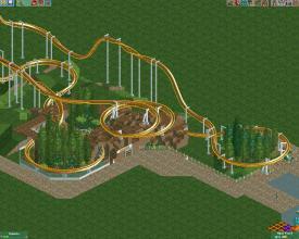
the only thing I dislike about that layout pac is that it has almost no invitation to have any interaction whatsoever... It's very compact and I think it's hard to make this kind of ride to actually work in a park or design setting because of the way it's so enclosed in itself
 -

 Arjan v l
Offline
^ I don't think it looks alright.
For starters... there are too many helices in that screen.
The interaction is forced... at least, it looks forced.
My advice would be, is to think more about a layout and think about interaction before you start building (interaction with paths, water, tunnels, queue etc).
Also... i don't see many elements and a flyer isn't a boring ride i.m.o.
That cave-like entrance is a nice touch.
But hey! Most of us started like this (including me), so don't feel discouraged by my comments.
-

 Naisn
Offline
thank you for the feedback. I won't feel discouraged in any way, I'll try to improve and reading criticism is the best way to do so
 -

 posix
Offline
It's not bad, but needs more ideas. I think a minimum of theme in the back of your mind will help. Just something to orient on as you go. Otherwise you build too much into the blue and it's easy to get lost and uninspired.
Try to set out a clear goal of what you want to create and realise it. The more complete your vision, the better. Try to foresee how "big" your ideas are, as in how much map space they will require, so that your spacing turns out right.
Also, I wouldn't get lost in landscape detailing like you seem to have a tendency for. It's relatively unimportant work if you get what I mean.
I like your colour choices by the way. Very clean and harmonic. Perhaps they could receive a few more shades that add contrast though. -

 Fizzix
Offline
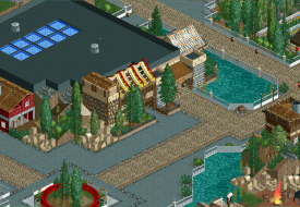
Good stuff Doomblade(nice name too
 ). I would put barrels or wagon wheel planters beneath those shrubs in the diagonals if I were you though.
 Tags
Tags
- No Tags


