(Archive) Advertising District / Dump-Place
-
 19-April 07
-
 RCT2day
Offline
Ow that design hurts my eyes, when making a layout have it look neat in a sense that doesn't look like some vommit without any details. Try taking inspiration from other layouts here and try to learn from them
Edit: oh and welcome to ne
Dude, this is much too harsh. The guy's new to the community (and maybe to the game) so go easy on him. Doesn't help him improve at all, just makes him become discouraged if anything.
Meznator: first, welcome to NE. This is a good first attempt. But, as others have said, I would encourage you to look at coasters in real life as well as some designs here in the database. That helix is awkward and too high, though. Just try to take inspiration and apply it in the game. -
 Jipalu
Offline
Try taking a look at layouts of real coasters, you need to think about something you could actually see being placed in a park and something people would enjoy.
 -

 Noahnator3
Offline
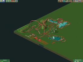
Hello Again. I am the one that made the green coaster from before! This is the account the picture should've gone on, but now another update, and this time, a lot more changes! Tell me what should change on it and i will try to change it. (P.S, the scenery by the station will change and it will probably be demolished and sorry for the white scenery, 8 cars per trainer had this problem.
-

 Hex
Offline
The pacing still looks like it wouldn't flow well. Coasters need to have that flow aspect, especially since you're building a B&M coaster. The layout looks like it's too spread out and just overall looks unnatural. That being said, I'm glad you put the cobra roll element in there, it means you were listening to the community about looking up images of coasters. B&Ms are generally taller than you made yours. I'm not saying copy them track piece by track piece. Keep looking at pictures of real coasters, and I'm sure you will get the hang of it in no time.

-S.C. -
 inthemanual
Offline
I think it meanders way too much. There's so many parts that look pretty boring. Try to keep the coaster exciting throughout, by using different elements and not just wandering around on the ground.
 -

 Lowenaldo
Offline
The pacing still looks like it wouldn't flow well. Coasters need to have that flow aspect, especially since you're building a B&M coaster. The layout looks like it's too spread out and just overall looks unnatural. That being said, I'm glad you put the cobra roll element in there, it means you were listening to the community about looking up images of coasters. B&Ms are generally taller than you made yours. I'm not saying copy them track piece by track piece. Keep looking at pictures of real coasters, and I'm sure you will get the hang of it in no time.
 />
/>
-S.C.
How do you know it's a B&M Coaster? What if its a Noahnator & Co coaster? I'll never understand the desire to categorize every single coaster and to insure that it follows a cookie cutter mold, why can't he get creative with his coaster? I say if he is happy with the coaster he should stick with it, add scenery and call it day. -

 Hex
Offline
Calm down man, I'm just saying what I think he needs to do. Yeesh.How do you know it's a B&M Coaster? What if its a Noahnator & Co coaster? I'll never understand the desire to categorize every single coaster and to insure that it follows a cookie cutter mold, why can't he get creative with his coaster? I say if he is happy with the coaster he should stick with it, add scenery and call it day.
-

 dawidox
Offline
I like this. The only thing I don't understand is that the stairs on the the right side lead into a fence...
 -

 Arjan v l
Offline
Neznator, Noahnator:
How much time did you spend building that layout?...
There's a lot of things that need to be considered when building a layout.
Interaction: Do you want cool viewpoints?
So peeps can look at the coaster, or eat at a restaurant while watching the coaster.
Layout going over paths, over water, through rocks, or interacting with other rides etc.
Flow: One of the harder aspects to get right.
Lets say that a coaster must be planned ahead, it needs to follow it's route with flow, not forced into directions. Although i see rides in real life with bad flow too, here at NE it's something we push ourselves to, to achieve it.
But getting a perfect flow is very hard, so don't beat yourself down if you don't achieve a perfect flow.
Good pacing: The ride should maintain a reasonable velocity, in a balanced way.
For example: ride reaches a velocity of 40 mp/h after the first drop.
Mostly, the ride should maintain that speed with some tolerance (5 mp/h), than you've got a steady pacing.
A (semi) realistic layout, with correctly used elements: use google
Queue interaction: Makes the waiting time more bearable, when peeps can view the ride or a close by element, or something pleasant, like gardens or a waterfall.
Some tips.
-

 Noahnator3
Offline
To Arjan:
What I plan on doing to the roller coaster is making it go through a beat-down town, and the peeps will be able to walk through the town a few smaller rides in it to. What i'm also thinking of doing is that the station could look like a town hall.
Thank you for some tips, anyway. I just started getting back into RCT2 a week or so ago, so I am very rusty. I am also just learning about flow and pace and the path intervening with ride. Also, custom scenery is also a pain to me right now because it's so small and very complicated. But once I get the hang of it, my park will look a lot better.
Thank you for your contribution to my ride.
Noahnator3. ☺ -

 Louis!
Offline
Totally unfinished, but when I saw this, I had to post it. Haha:

Shame it glitches so much
-

 djbrcace1234
Offline
Yeah, oh well.
If anything, I just wanted to see if it was possible, and I actually like my version of this coaster.
 Tags
Tags
- No Tags


