(Archive) Advertising District / Dump-Place
-
 19-April 07
-
 RCT2day
Offline
^I agree with Ruben on both pictures.
djbrace: nice colors and interaction but landscaping has to be a priority in making that screen better. I'm assuming it wasn't finished?
enigma: Ruben makes a good point, it's not very natural and the flowers are pretty random. I would expand the waterfall to use that space where you have the flowers to add color and make it interesting. -

 geewhzz
Offline
DJbrace you're on the right track. Something I really like about the composition of the screen.
 -

 nin
Offline
Neat screens both of you.
djbrcace1234, the colors are stale as everyone's said. I'd love to see some low lying foliage at the under the Schwarzkopf though, would look good for both rides.
enigma, I like it a lot. I think you should turn much of the dirt/grass to just grass as it'd brighten up everything and make it look cleaner, but overall I'm pleased as to what you've been doing with that park. -

 Ling
Offline
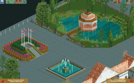
I quite like the feel of it, but I think the flower colors clash with each other, I think the wall-to-roof texture transition is clunky and unrefined, and the weird 3x3 grid going on in your paths is just distracting. I would break it up into something that more properly fits into the space, like maybe 2x2s or just simple 1x1 concrete slabs. The rocks and the gazebo look fine as they are. No fence needed.
 -
 Jaguar
Offline
Pro: The screen is very neat and I really like the Gazebo
Con: The large amount of grey path is depressing, and real shake roofs aren't pink. -
 SixFlagsTexas1994
Offline
yeah the pathway for most Six Flags parks (i assume that's what it is) in the entrance is more inviting than the rest of the parks. Despite what has already been said, why no fence?
 -

 Ruben
Offline
Pink and red don't go together, unless they're supposed to clash. In this case I think that's not what you're going for with the flowers, so maybe experiment a bit more with those? Another small detail: Why is the top of the brickwork blue? Is it supposed to represent a water basin or something? It looks very forced IMO.
Next to these details it looks very clean, and I quite like it. The Gazebo looks great and the foliage/rocks are very appropriate I think. Only thing is most tree trunks aren't really green...
(P.s. Maybe some more American pride? Sure you can fit more american flags in that screen (A) ) -

 posix
Offline
Addict, good start. Consider breaking up the paths with more complexity. You chose a very strong grey concrete looking path that has very basic shapes (squares (with sometimes rounded edges)) cut out from it. I think even just a tree somewhere in there would do it well, or some gardens in a 4x1 square "stripe".
 -

 Casimir
Offline
On an unrelated note, I'd really like to see some work by you again, posix! Just came to my mind =)
 -

 Faas
Offline
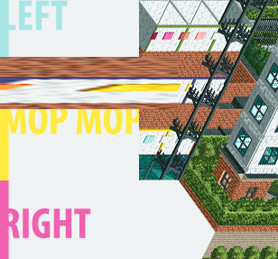
I reckon the 'shopping' of this picture took more time than actually stacking those few walls on each other and taking a screen of it.
 -

 SoCalCoasters
Offline
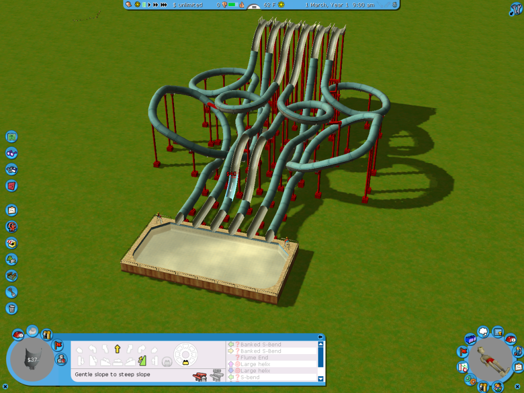
I think the catch pool needs to be longer.
The length is fine in terms of peepablility.
Done a bit more work. I'm experimenting with a large scale water park type of environment.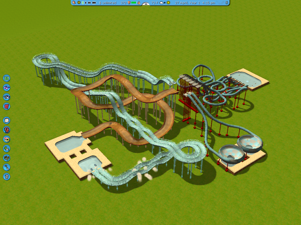
-
 Mattk48
Offline
i like it. you should have all those slides sitting on a huge hill/mountain. change some of the colors
 Tags
Tags
- No Tags
