(Archive) Advertising District / Dump-Place
-
 19-April 07
-

 Pacificoaster
Offline
Brick, brick, brick, fisherman arch, brick, brick, window, brick, brick, fisherman arch, brick . . .
 -

 chorkiel
Offline
mrbuckeye, that feels so enclosed. It's like you're trying to hide the park from guests.
 -

 In:Cities
Offline
 Should I stick with one colored path?
Simply beautiful. As stated before, the yellow pathing can go. But other than that, I think it looks fantastic. Tons of atmosphere! -

 Pacificoaster
Offline
yes pacific we all get the fact that you like being a dick.

I really am not much of a dick. When you post screens like that, I am just speaking my mind. Here are some more observations:
1. The structure and even the foliage is mirrored right down the center. Not every entrance plaza is symmetrical. In fact hardly any are.
2. There is so much grey. The main building, the tickets booths, the path, etc.
3. The use of fisherman arches do nothing for the building.
4. What's the purpose of that main structure? There are no doors (Aside from the two on the top balcony)?
5. Have your architecture depict a structures identity. The most confusing thing is when I look at a building and I have no idea what it is supposed to be (making a sign and saying what it's supposed to be is NOT what I am telling you to do). -

 Scoop
Offline
im pretty sure a lot of people here would say otherwise about you not being a dick
\/ he did give really good advice however thank you for that. -
Whitehawk Offline
He's actually pretty cool, and an excellent park maker. Focus less on accusing him of being a dick, and more on the excellent advice he is giving you
-
 Maverix
Offline
He speaks his mind and isn't afraid to be honest, even if that means being mean. Quite different to being a dick.
Here's a shot of the park I'm working on.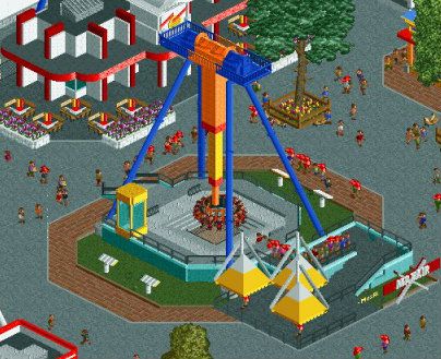
Going to start a topic soon, but I want to get a bit more done before I do. -

 trav
Offline
Looks pretty hot Maverix, but there's nothing making it stand out from the 2039482342893 Huss Frisbees we've seen
 -
 Camcorder22
Offline
Making a completely enclosed and boring building and justifying with "Maybe there's something cool inside" is admittedly, one of the stupidest things I've ever heard.
Maverix, not sure about those tents over the line, also the texture used for the line doesnt' really work for me. The building at the top looks really interesting though. -

 Scoop
Offline
not inside the building inside the park.Making a completely enclosed and boring building and justifying with "Maybe there's something cool inside" is admittedly, one of the stupidest things I've ever heard.
Maverix, not sure about those tents over the line, also the texture used for the line doesnt' really work for me. The building at the top looks really interesting though. -

 Casimir
Offline
Build for your and our eyes first. Peep's hypothetical eyes second. At the most.
Which means: Don't build what you think the peeps would see as cool. Start with stuff that looks cool in the isometric angles. If you have that covered, only THEN start combining the two. -

 ZeRoSkIlL
Offline
QFT. I agree with both parts. mrbuckeye, it seems like you're pretty new to the community and coming from experience as a rookie RCT player, you might want to take your punches and try to take advice as it comes. Also, don't build to impress anyone here - build because you want to. Build because you have an idea you want to implement. Don't post screens of all your work either - then there's no point of downloading the park if/when you finish it.Making a completely enclosed and boring building and justifying with "Maybe there's something cool inside" is admittedly, one of the stupidest things I've ever heard.
Maverix, not sure about those tents over the line, also the texture used for the line doesnt' really work for me. The building at the top looks really interesting though.
Maverix, I think you're trying to emulate the tents that are stretched over queues at parks (like these in the background / top of the picture) but those look like they're just floating. That seems like a tough structure to pull off - maybe vary their size and use more flat quarter blocks?
I also REALLY like the lightening bolt you made on the building in the top of the screen. Is it supposed to be like The Flash's logo?
 Tags
Tags
- No Tags


