(Archive) Advertising District / Dump-Place
-
 19-April 07
-
 gijssie1234
Offline
hey i'm indeed making a bigger park , maybe from another angle isn't that bat to give you a better view xD
gijssie1234
Offline
hey i'm indeed making a bigger park , maybe from another angle isn't that bat to give you a better view xD
-
 Ling
Offline
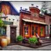
That curved fence is nuts. I really like the building on the left. Maybe slightly over-detailed, but it looks good. Not exactly sure what the theme is though. There are too many flags on the restaurant on the building on the right, and I think the patio could use some kind of benches. The empty grass seems a little, well, empty.
Ling
Offline
That curved fence is nuts. I really like the building on the left. Maybe slightly over-detailed, but it looks good. Not exactly sure what the theme is though. There are too many flags on the restaurant on the building on the right, and I think the patio could use some kind of benches. The empty grass seems a little, well, empty. -
 leonidas
Offline
leonidas
Offline
lol, you're really... confident.The front of the building is even better and more detailed that the back side like you see here xD
The wooden roller coaster is almost totally diagonal and still looks really awesome and got a good smooth flow.
But you got it right, it does look extremely good. The white building is gorgeous and so is the restaurant although I agree about the flags. I'd really love to see some Forresty area's in this park, or a big lake. -
 BelgianGuy
Offline
again this looks like details for the sake of details...
BelgianGuy
Offline
again this looks like details for the sake of details...
try a theme, if someone says, nice details but I can't decipher the theme, somethings wrong then... -
 Phatage
Offline
^Not every area has to have some exotic theme. It would help though if you stuck to completed screens Gijssie. I really like the idea of the path you have going under the woodie in the screen you showed on the previous page, but that path does feel claustrophobic, especially with the footers. Any way you can widen it or give more clearance above while preserving enough of the structure?
Phatage
Offline
^Not every area has to have some exotic theme. It would help though if you stuck to completed screens Gijssie. I really like the idea of the path you have going under the woodie in the screen you showed on the previous page, but that path does feel claustrophobic, especially with the footers. Any way you can widen it or give more clearance above while preserving enough of the structure? -
 AvanineCommuter
Offline
@gijssie1234 while it looks good, it's just as sterile as PineHills... Too much gray and white, looks lifeless. I would LOVE to see you attempt a theme besides the generic amusement park look, which you seem to have perfected. Also, COLORS ARE YOUR FRIENDS!!!!!
AvanineCommuter
Offline
@gijssie1234 while it looks good, it's just as sterile as PineHills... Too much gray and white, looks lifeless. I would LOVE to see you attempt a theme besides the generic amusement park look, which you seem to have perfected. Also, COLORS ARE YOUR FRIENDS!!!!! -
 Nilsson Schmilsson
Offline
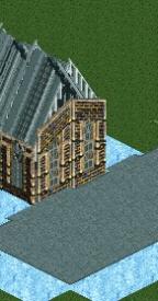
I wanted to start an Old West themed corner of my park, but I'm out of ideas for layout. I already know what rides I want to put here, and I know I need new buildings. I just can't figure out where they should go. Any tips? What do you think of the small buildings already there? And the fort gate?
Nilsson Schmilsson
Offline
I wanted to start an Old West themed corner of my park, but I'm out of ideas for layout. I already know what rides I want to put here, and I know I need new buildings. I just can't figure out where they should go. Any tips? What do you think of the small buildings already there? And the fort gate?
-
 MikaRCT2
Offline
^Do you have a larger screen of that? I can't really see it because it's too small to see the details.....
MikaRCT2
Offline
^Do you have a larger screen of that? I can't really see it because it's too small to see the details..... -
MikaRCT2
Offline
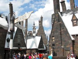
That's better yeahThis any better, Mika?
 I had to follow the link though.
I think that the sides need more detail, like windows etc.
Edit: I saw the second pic, and that needs more detail almost everywhere imo. -
MikaRCT2
Offline
^Use the link. If you don't know how, click on "Reply" under Nilsson's post and copy the link from the pic.
-
 BC(rct2)
Offline
I know how to use links but thank you.
BC(rct2)
Offline
I know how to use links but thank you.
That looks cool, I don't know why but I like it. -
 Super G
Offline
Super G
Offline
That's better yeah
I had to follow the link though.
I think that the sides need more detail, like windows etc.
Edit: I saw the second pic, and that needs more detail almost everywhere imo.
You know you can't add that much detail in LL I hope.
Looks realy familliar. Love it!

 .
.


Tags
- No Tags