(Archive) Advertising District / Dump-Place
-
 19-April 07
-

 posix
Offline
dark horse was wrong about the english thing and had a hard time admitting it after going a few steps too far. isn't it okay now? why do you have to keep targeting him with hatefulness ...
 -

 In:Cities
Offline
yeahh sorry about that.
i'm not sure why, but he's like the only dude here that annoys me.
sorry for the 'hate'.
i dont hate the guy, i just got overly annoyed this time.
wont happen again man -

 ar2910
Offline

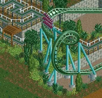
Unfinished at the bottom and rubbish masking at the back But what do you think?
PS. It's a composite of four screens... it isn't all in miniature Oh, and it's all peep friendly.
Edited by ar2910, 20 January 2010 - 04:43 PM.
-

 Goliath123
Offline
Wow, the style i love <3
I absolutely love screens and building stuff like that, miniature railways and the like(yes its a hobby of mine).
Were you by any chance inspired by this?
http://en.wikipedia....rLandwasser.jpg
It looks like you've done a good job on the mountain and the track, but the power line should be a mini suspended coaster, i personally think it looks better -

 ar2910
Offline
Goliath123:
Thanks for the loveage The Swiss Railways/Alpine influence is definitely there, but it is somewhat an amalgam of styles... there's going be a BIG surprise for this particular themed area when it's all finished though!
I tried a miniature suspended coaster, but it didn't fit the curves very well Perhaps it would be worth giving it another shot
-

 ar2910
Offline
Oh I have used trams
 It's also a circuit track. The two buildings in the picture are the stations.
-

 Goliath123
Offline
If your going for 100% realism use shuttle mode, these type of things in RL have a train engine that goes at the start of the trams and is used to push not pull the trams along, i'll try and find a pic for ya
 -

 ar2910
Offline
Thanks
 But I'm going more for park realism in this one ie. as many people through as quickly as possible. Shuttle mode would take a heck of a long time to make a trip. Plus there is no entrance at the upper station, so all the return trains would come back empty...
-
 MF72
Offline
all friends of DH raise your hand!
*raises hand but puts it back down when no one else raises their hand*
ahank: I really like it, however I think you should stick to just one texture on the walls instead of having it switch in the middle.
ar2910: I really like this as well. It seems like the terraforming could use some work, but overall it's a nice screen. -

 Goliath123
Offline
OK heres some more tips for the area then:
The landscape needs a lot of work, take a look here for that:
http://en.wikipedia....wiki/Swiss_alps
This is also worth a look:
http://www.miniatur-...ut-switzerland/
and here too:
http://www.miniatur-.../about-austria/
This place is great as well:
http://en.wikipedia....Glacier_Express
This is what i use for the general track layout and so on:
http://en.wikipedia....Glacier_Express
There is others like that in Wikipedia and other miniature railways that are great for landscaping purposes such as "Noch Modhelbanh" and take a general look around the miniature wonderland website while your there, that should do it.
Wow i never new i could be so helpful
-

 ar2910
Offline
Thanks
 I appreciate the research
  How would you reccommend improving the landscape? I reiterate that this isn't supposed to be Switzerland, it just has a mountain railways inspired by those in Switzerland... And I'm only making this park realistic, not Matterhorn realistic
  But like I said, how can I improve to landscape?
-

 Goliath123
Offline
More 1/4 tile landscape blocks, much denser foliage, it has to be more steep, like at the moment it looks like the base of a small mountain, not big enough for a ski slope. Also the plant selection isn't very alpine like, no jungle bushes in Switzerland
Thats the basics covered, i'll post more later on -
 Jaguar
Offline
Jag, take note, that is how to do an Intamin SLC

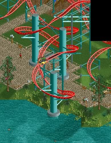
Good one, and I will improve from my old intamin blast coaster concept.This is my first post here, I hope you enyoy my work.
Those screens are my latest work, they arent finished jet.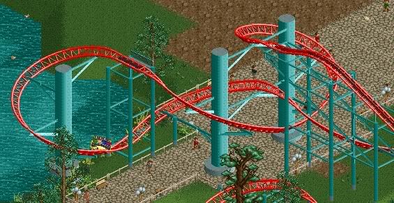
from a few months ago:
(sorry for my bad English )
)
I am eagle eyed, I am guessing that layout is Race the Sun at Magic Realms Resort created by eyeamthu1. Good supporting though I think it is better than the B&M styled ones.Edited by jaguarkid140, 20 January 2010 - 09:46 PM.
-

 tracidEdge
Offline
i'm sure you can find a better way to pull off the vertical supports. also the path there kind of looks weird with no supports. kind of like it's sitting on the water.Um. Anyways.

-

 Cena
Offline
Jaguar: Loving the fluidity of that back turn on your coaster! The trees look a little off colour though...
I think he quoted someone .
.
-

 Robo10000
Offline
ThanksThose screen look pretty cool. Nothing over the top, but I like them. Oh, and you speak English fairly well.
I think this is the smallest "big beam" i`ve sellected but I wil look after it.Personally i think the main support beams are too thick, but everything else is good

thank you, this give me a real boost to finsh itthose screens are fantastic! truley a breath of fresh air robo
 .
.
Thanks.I love the spinning wild mouse.

You on a park with RamSam would be pretty cool, i guess.
I think they are my best work I produced so farRobo, i really love the third and fourth screens for some reason.
i'm not really sure why, but those stick out to me the most.
nice work:] .
.
Well, actualy the first drop and helix are indeed from Race to the Sun. Thats because I saw that coaster and I want to make something like that. But the first drop failed again and again, thats why I copied it from the Race to the sun.I am eagle eyed, I am guessing that layout is Race the Sun at Magic Realms Resort created by eyeamthu1. Good supporting though I think it is better than the B&M styled ones.
 Tags
Tags
- No Tags

