(Archive) Advertising District / Dump-Place
-
 19-April 07
-

 Lowenaldo
Offline
meh, its boring and bland.
jag: i actually overlooked the fact that those were all custom supports, nice! and i have to agree with steve, jag you have alot of potential.Edited by Lowenaldo, 07 November 2009 - 02:22 PM.
-

 tracidEdge
Offline
fuckin zing!I mean before he was nice on the forums and sucked at the parkmaking. Now he is mean on the forums and hasn't really improved.
-

 ACEfanatic02
Offline
If you want a good wooden coaster, you need a good layout. That isn't.Don't worry, I'll use more textures than just grass. I was really just trying to show layouts, and I am a real fan of wooden coasters, and I like to make them more accurate. Infact, I might use hypercoaster trains for morgan woodie trains, or PTC six-seater articulated.
Your supporting idea is nice, and there are parts that are executed pretty well. But the fundamentals come first.
-ACEEdited by ACEfanatic02, 07 November 2009 - 02:37 PM.
-

 J K
Offline
meh, its boring and bland.
Really? that has such a nice composition and actually a lot of atmosphere.
Also Jag keep trying new things. A lot of newbies these days try to be a park maker they admire where your just being you and building stuff. All the other newbies are kinda hating because your actually on your way to developing your own style.
I don't think Sammy was meaning to be as harsh as it came across but an opinion is an opinion, just actually a very narrow one at that. Sam I've noticed your kinda really dissing the work of people you don't get on with.
Meh life goes on. More screens! -

RMM Offline
blah blah blah. most people do suck. that doesn't mean they don't know what looks good and what doesn't. sports coaches, you think they can do what their players can do, even in their prime? they can't throw a 60 yard pass, a windmill dunk, hit .300 a season. that doesn't mean they aren't great coaches. SSSammy might think the game better than 90% of us here. who knows. and just because he might not be able execute ideas in his own parkmaking as well as the best, doesn't mean he can't criticize and comment on other peoples shit.Edited by RMM, 07 November 2009 - 02:50 PM.
-
 Jaguar
Offline
Most (wooden) coasters that follow the terrian use nature itself as a theme. I think you did a good job with the landscaping. You could try making the coaster a shade of brown and maybe that would make it feel a little more natural. I am not going to tell you to get rid of the plasma ball or spaceship because I can see what your going after.
It really isn't much of a terrain coaster, it just goes through its first drop, and then it goes in a figure-8 shaped track through a ravine and circles around a lake. I think it would look good brown though. If I have time though, I might make a good GCI that'll make this coaster look tame.
Ace, that coaster isn't the best of layouts, but unfortunately there is nothing I can do now but restart, and that'll just put me behind.
Just another idea for my coaster, I might add some grey and tan track, to make it look like there is track stains from the oils and lubricants.
About faas's screen, I like the idea of the cars on the single-rail track, but why? -

 Liampie
Offline
I really like that. The buildings can have one more colour, organise the fences and it'll be perfect.
 -

 Splitvision
Offline
Yes an additional colour would be good, maybe different textures on the green rooves aswell. I'd also like some more detail on the bare walls. Other than that it's looking nice.
 -

 Comet
Offline
Steve, ignore SSSammy he is going through a phase where he believes he is actually intelligent.
Haha, that was actually pretty funny -

 Splitvision
Offline
Just a thought isn't it time to start a Dump-Place v2? So that we don't end up having 1000 pages of posts...
 -

 Liampie
Offline
Agreed, Split. When I'm looking for a certain old screen I can't find it if its in the Dump. 276 pages is a lot!
What about finishing this year with the current Dumpplace, and then having a new one each year? +an award for best Dump-Place screen each year
Edited by Liampie, 07 November 2009 - 05:43 PM.
-

 Jaguar
Offline
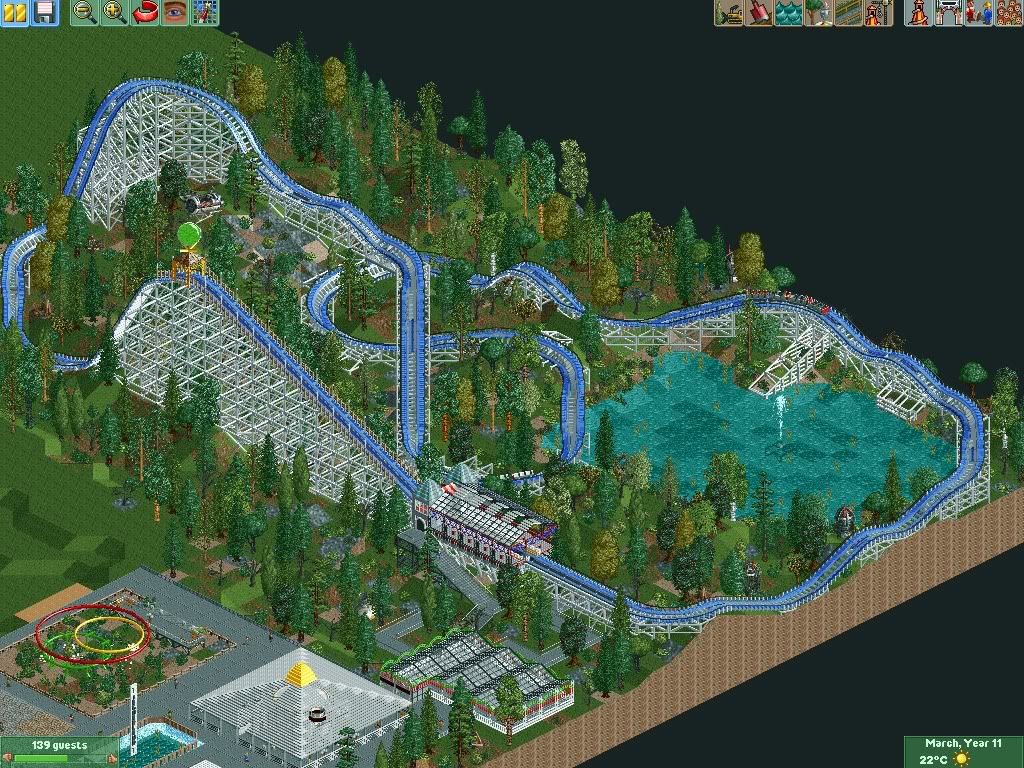
Sorry about the poor image quality. Here is an aerial view of Lunar Rockets racing through the ravine and around the pond.
-

 Caliber
Offline
OH! Now I see what you're going for!
Might want to use less banked turns, though. Classic coasters barely use many banked turns in them. -

 Splitvision
Offline
That's great idea Liam, but maybe we should do it every six months or so, this thread started sometimes back in 2007, so in about two and a half years we've made 276 pages of posts... that's about 110 pages per year, and 55 per every six months. 55 pages of pics is quite a lot and I believe enough to have atleast one extremely good screen in it.
Jag - It looks a lot better with foliage. I think a space themed woodie is a quite odd concept though. Especially seeing as it's hardly themed at all, you have a satellite and a futuristic looking station, that's it. And the green balloon does not belong in RCT. Still, it looks better than before.
Just fucking around, thoughts? I've always sucked major balls at flyers...
Edited by Splitvision, 07 November 2009 - 06:48 PM.
 Tags
Tags
- No Tags
