(Archive) Advertising District / Dump-Place
-
 19-April 07
-

 SSSammy
Offline
SSSammy - good concept but it's so bare and lifeless. Put in some plants and buildings and colour.
Thankyou! that is exactly what i couldnt think of.
i completely agree with you.
right, ill go sort that out.Edited by SSSammy, 02 February 2009 - 03:26 PM.
-

 Louis!
Offline
Cheers guys and Turtle, yeah I was trying to think of a better way to do it, but there wasn't so unfortunately it is the same as Rampage, and as Rampage inspired me to do this is the first place it shares the same double down first drop, however the rest is very much different and the timings and duels and racing parts worked out quite well.
But yeah thanks for all the comments, this should have a topic of it's own soon. -

FullMetal Offline
I think you mean "since you can mix them". The primary colors are the basis for every other color in existence.primary colours are red,blue,yellow since you cant mix them
colours that make up light are ROYGBIV
Sorry for the interruption. Carry on. -

 rct2123
Offline
^He means you can't make the color by mixing...
For the record...
Paints and such - Red blue and yellow are primary
Light - Red blue and green are primary
Just to clear things up...
-Rct2123 -

 JJ
Offline
^ And since we're talking about painting rollercoaster cars
But then again they are displayed via light. lol. -

 rct2123
Offline
Yeah yeah yeah, lets just say it was a stupid comment...
Whether it was green or yellow its primary in one way or another...
-Rct2123 -

 JDP
Offline
^I think you could have pulled off a closer shot by zooming in one more click. That way we can get a better look.
-JDP -
 TheLegendaryMatthew
Offline
^^^ Needs a lot more before it can be call'd "Finished"
Heres some stuff that may turn into something, but this was just something I did real quick.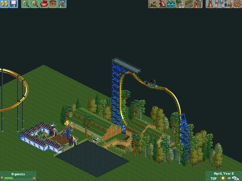
^This is an old, old, old picture from November. I found this on the flash drive!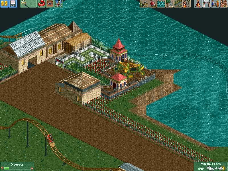
^Trying a new style.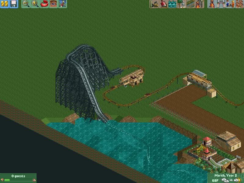
^Trying a new style of coaster and hack. I could not make it invisible. -

 TheLegendaryMatthew
Offline
^^^ Needs a lot more before it can be call'd "Finished"
Heres some stuff that may turn into something, but this was just something I did real quick.
^This is an old, old, old picture from November. I found this on the flash drive!
^Trying a new style.
^Trying a new style of coaster and hack. I could not make it invisible. -

 zodiac
Offline
^I think you could have pulled off a closer shot by zooming in one more click. That way we can get a better look.
-JDP
that'd give too much away.
 Tags
Tags
- No Tags
