(Archive) Advertising District / The Park With No Name
-
 22-December 06
-

 tracidEdge
Offline
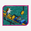
those little tree things are pretty cool. you could put them throughout to break up the path a little bit. that way it won't seem like so much path. also, see if you can't make the tree trunks a little thicker?
 -
![][ntamin22%s's Photo](https://www.nedesigns.com/uploads/profile/photo-thumb-221.png?_r=1520300638)
 ][ntamin22
Offline
overdoing the yellow embellishment on the saw building. the trees are cool, but maybe use different bushes so you haven't got a rectangle of identical trees. can't really see enough of the station to judge.
 -

 Milo
Offline
Not bad. Coaster looks pretty good with a nice little turnaround you have there. Overall the area looks solid as well (pretty nice landscaping and foliage although some flowers wouldn't hurt on the edges of the paths). The buildings are nice tho a little simple... you're still experimenting so I won't be too critical on that. I really like where they're placed in realation to the coaster tho. My only real complaint is that the path needs to be broken up a little. Right now it is like a solid border to little 'pockets' of nice rct work. Get rid of some of the tiles in the middle and put some foliage and flowers in there. Also, some seating areas wouldn't hurt either. Maybe build little covers over some benches and such. I like the way the path is set up with all the stairs and such tho. Real nice.
All in all some solid work. Just break up those paths and you'll have a nice little screen. -

 RCTCA
Offline
Looks good. The coaster's interaction with the foilage and buildings are really cool. As OLE said break up the pathing and add benches, garbage cans, lamps, etc. Do those buildings have a purpose? To me they look like a restaurant or giftshop. Also add flowers next to the path and it wil look great. Overall nice park. Keep experimenting with those building. Can't wait to see more.
Keep it up!
/RCTCA\ -

 nimrod
Offline
Thank you guys.
I've been working a lot lately. I've finished theming Crazy Train, but I don't like working on one specific area for too long so the other two coasters aren't fully themed, and I've built another one, just a small kiddie ride, named Lil' Bugger.
I always add benches and lamps last so I didn't forget them in this pic.Edited by nimrod, 20 January 2007 - 06:05 PM.
-

 Ling
Offline
well, as for the woodie pic, it looks great... add flowers and it'll be perfect.
As for the second pic, not much to say -

 geewhzz
Offline
Those screens both look really nice. The coaster interaction seems very good. My only but is the foilage. It seems just too squeezed in. I spot a few odd looking jungle bush and willow trees with no water insight. They look a bit out of place. Kudos to the coaster train colors, though.
 -

 Carl
Offline
I don't think you have too much foliage there, but I would get rid of the willow trees, and use more smaller trees and bushes instead of so many tall ones.
 -

 Genius638
Offline
the last pic of the 'broken up' path is really great...now you just have to go back and do it for the 'lil bugger' path. It's huge! and maybe, y'know, make the paths a little less straight. A twisty sort of path will eliminate and boringness in looking at your park.
BTW, the wooden coaster is really great, but it seems to be on an island of terrain surrounded by path...I dislike that. -

 Ling
Offline
that^ and the textures on the building on the right make me cringe. I would take out the steps-as-roofs and replace the green with brown. Yellow within itself is hard to work with, but don't add in a sickly green...
 -

 gir
Offline
I'm no expert but I think usually you don't want dips in your rooves where water can collect in pools wherever it rains. Yeah, there could be gutters, but isn't that less efficient? That, and it visually looks weird. I like the fact that you're trying to break up the path, but what you're doing in those two areas (the foilage and the building) is narrowing 4 lanes of traffic down to 2 lanes, and that isn't very "peep friendly" so to speak. Either divert the path around these spots or narrow them down so they're less intrusive. I'm thinking the former might be the best bet though beacause that building on the bottom left is the best one in the picture imo. It wouldn't hurt to make your paths less-square anyway. I don't think your foilage is really strong (choice and placement), but I do like how the coaster comes right up to the edge of the path. Also, I'm not a huge fan of the cement block fencing you have because it looks really thin. You could try doubling up the fencing on the other tile to give it a little more thickness.
Hope I helped a little!
 Tags
Tags
- No Tags


