(Archive) Advertising District / The Park With No Name
-
 22-December 06
-

 Milo
Offline
I like the look of that. The station looks pretty nice and the coaster does as well. Some benches and lamps and trash cans wouldn't go amiss tho.
 -

 Ling
Offline
woah that looks pretty cool
although I think a better fence style could be selected to alongside the path there... Something that is still see-thru, but more solid... Does that make sense? -

 Genius638
Offline
on some of your first screens....
your paths are too wide, I think that's why they look so dull. The buildings and archy is fine, but the huge paths need to be broken up with foliage or thinned down.
As for your latest pic...it's good, but it lacks details I think....is this meant to be realistic? -

 nimrod
Offline
It's meant to be kinda realistic, like in the middle of realism and fantasy, I can't explain it good. Not very realistic but not very unrealistic, or something.
 -

 Ride6
Offline
The way that coaster interacts with everything in there and the fences around the paths are ace. The building itself would suck if it wasn't for that overhange for the Q. Just because of that overhang I can picture myself standing in that Q, wating to get out the of sun (under the overhang) as the coaster goes roaring past. Takes me back to Holiday World in a way, which can only be good.
All the other screens are shit next to that one. That one is excellent, but don't loose heart with everything else, it's alright, it really looks like you're enjoying the game and if more people built parks like this, that weren't so overly detailed, I think we'd have a lot more full-sized solos being released these days.
Ride6 -

 geewhzz
Offline
Very nice atmosphere...although I'm not liking the railing covering over the railing that the path draws.
 -

 Ling
Offline
it looks odd... maybe it's because it's so small... I don't know, but I just don't like it...
 -

 JDP
Offline
Looks good. Remeinds me of the small stands you see in real parks just to grab something to eat. I like it.
-JDP -

 FK+Coastermind
Offline
okay i know im going way back in this topic but....
for the coaster im not a fan of the turn back into the station. from what i can see it looks like the coaster just flys over the pavement and into the station which isnt that realistic. try to make area of foliage or something for the coaster to go over to get into the station and then have the path go over or under so that it looks more realistic. im not a fan of that archy either. try to add some detail and more windows and such. right now the station looks like a big block. its a good start but it needs more.
the candy shop is a little bright for me. you can do bright colors but it depends how you do them. you can have brights you just dont want it to be to hard on the eyes. try to break it up with some bright yet slightly duller colors. otherwise i like the shape of the building.
for your last pic its nice and detailed but again it has alot of room that looks unrealistically wasted. more windows and less black walls. i like the wooden frames you have on the inner walls but i think they would look great on the outer walls around the windows. try some layering with windows and railings and such.
its a great start but i think detail could help make this park better. by realistic i dont mean like a real park but more that even a fantasy park would have some realistic parts to it. a castle surrouned by molten lava would still have windows and doors and balconies even though it probably not real.
hope that helps. great start. keep going
FK+Coastermind -

 nimrod
Offline
Thanks for all of the comments everybody.
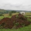
I don't know what happened but this huge pillar of land just appeared in my park and I can't lower it. It says I can't lower the ground because it is too high. Here's a pic. And I already saved both of my games without knowing it was there.
Here is a better station, hopefully.
And a building, I was experimenting with this one
Edited by nimrod, 06 January 2007 - 06:36 PM.
-

 Milo
Offline
That's just a glitch... use the 'Cap all land at max height' function on 8Cars I think.
That station is a big impovment on your texture skills. Nice job there and no complaints. The experimental building is nice but I dunno... it seems to be sitting a little low which makes it look a bit strange. -

 RCTNW
Offline
Nice work! I like the look of the second building.
OLE - you are correct regardign the glitch
James - rctnw -

 Gwazi
Offline
Yeah, OLE is right. The station looks great, and the other building looks even better. Keep "experimenting", it will get you very far, if that's how you do it.
-

 JDP
Offline
seems reasopnable. i like the way you mixed it up with the roofs in the first screen. good job.
-JDP -

 Ling
Offline
uhh, I can't see the pic of the station...
as for the experimental building, it looks great. Tons of detail and everything. -

 Genius638
Offline
I haven';t seen this park lately....your paths are all too wide, it makes all the buildings look smaller
 -
 Loopy
Offline
Going from all of the screens theres WAY too much pathing. It just seems like a huge block of path then with a building/ride thrown in the centre of it to break it up slightly.
Although, I really do like that Crazy Train screen and that building does look pretty cool. Just work on your pathing more and you'll be onto something. -

 Ling
Offline
yes, too much path, and the yellow details on the building for "Saw" hurts my eyes. I would try something softer, like a white or tan, even.
 Tags
Tags
- No Tags


