(Archive) Advertising District / The Park With No Name
-
 22-December 06
-

 geewhzz
Offline
Try and break up the supports placed on the path with a row of bushes or something.... And your roofs, try building your buildings so your roof end peices match with the right textures.
 -

 Milo
Offline
Pretty nice although your uses of textures is a little odd (mostly what geewhzz said). The foliage could be a little better as well... right now it is a little random.
 -

 Lloyd
Offline
Not bad, go with Geewhzz's idea of breaking up the supports with some foliage, always looks neat, and just think about the textures (as has been said). I Think that the bottom half of 'Dragonfly's station is ok, but then the top half (above the decorative fence) gets repetative and boring. Just mix those bricks up with the textures used in the bottom half.
Keep going! -
 woofenskid
Offline
looks a little better, but try to surround them. not overwhelmingly, but enough to keep them partially hidden.
 -

 Milo
Offline
Better but I think you should just get rid of the path pieces they're on and put the land type to dirt or something and add some more bushes and maybe even some flowers to cover them a little more.
 -

 Carl
Offline
^ I pretty much agree with that, cause you don't want your peeps walking thru the support bases, or the shrubs that surround them.
Carl
Offline
^ I pretty much agree with that, cause you don't want your peeps walking thru the support bases, or the shrubs that surround them.Edited by ride_exchanger, 26 December 2006 - 03:32 PM.
-

 Lloyd
Offline
Uhuh, to like third what these guys ^^ said, you know, if you didn't fence off the supports, and someone happened to have any welding material handy, it could be bye bye to Mr. Suspended Coaster.
Although, to contradict myself, i have seen support bases not be fenced off before. Hmmm, so err, yeah. I'd fence 'em off though
-
 CoasterCrzy
Offline
The textures dont work for me.
I like the idea your going for though, keep going at it. -

 Lloyd
Offline
Yeah i don't think the textures are right, and it looks half finished. If this is still sort of a generic themed candy shop, i think you're being a bit drastic with the colours, looks like something outta Divinity Ridge. But if you want to keep the front you have on it, make sure you mix up those bricks, because they look really repetetive. Run some bands of colour through them, like the colours you have used, run a pink band through it or whatever, just make it look a little less boring. Also i think you should zero clearance some thin poles over the path, to hold up that platform above the entrance.
 -
 RCTCA
Offline
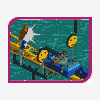
The support work on the first few screens is really nice. Your foilage choice is also great and that roller coaster looks really fun.
Can't wait to see the other rides in the park.
Keep it up!
-RCTCA -

 RCTCA
Offline
Both go kart tracks looks really fun and nice. You also have great foilage and colors. :-)
RCTCA
Offline
Both go kart tracks looks really fun and nice. You also have great foilage and colors. :-)Edited by RCTCA, 29 December 2006 - 11:33 PM.
-

 Gwazi
Offline
^ Yeah, they both look fun.
What you have is nice, but I would break up that path. Oh, and put in some path objects.
-

 Casimir
Offline
I really like the realistic feeling there. Nice work with the foliage, the station may could need some further designing
Apart from that, I'd appreciate seeing more from you ^^ -

 dr dirt
Offline
I'll admit this is some really nice stuff. The second screen makes me want to go there and ride them. The black doesn't work of the colums on the station. Truely, this is nice.
 Tags
Tags
- No Tags


