(Archive) Advertising District / New Solo
-
 13-October 06
-

 Dixi
Offline
You not going to give those poor customers something to look at when their eating out side? Also those textures (and also lack of more) are really killing the screen dude, its such a dark place. It needs sprucing up with some sexual chocolate (Colour).
 -

 Ling
Offline
lol
yes, the cafe needs some "damn tables" but everything else looks pretty nice and atmospheric, except for the blatantly unfinished parts. -

 Lloyd
Offline
Obviously the layout won't look as good as when it s themed, but at the moment, it just looks ok. Not the most thrillng layout ever, and not very typical of a floorless. But it's something new, so fair enough if you want to try it.
Oh, and a word on the screen before this one. I wouldn't use those castle turret walls on the floor, try something else there. Stick those castle turret walls up on your buildings and they will add a whole lot.Edited by emo_ffaf, 28 October 2006 - 03:25 AM.
-

 RCFanB&M
Offline
Well, I think that it looks fun. You used the typical B&M inversion elements, but I don't think that the whole layout is totally B&M-ish.
Anyway, I'd like to see it themed for making a more complete comment. Keep going. -
 twister12
Offline
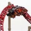
@rcfanb&m- i planned this to be a little less b&mish.
or at least for a typical floorless design. this is kind of a floorless twister/hyper. -

RMM Offline
I like the layout but I dont like the way the turns area and all around the corkscrews. Maybe it just the angle though, not sure. It looks pretty nice overall though. -

 geewhzz
Offline
The layout shows promise that you know what you're doing with coaster design. It just needs to be refined a bit more.
 -

 Ling
Offline
yeah, the layout ain't that great (I'm particular about my B&Ms as I'm a hardcore fan) and could be more... rounded? As for further commenting, I'll need to see theming.
 -

 Carl
Offline
Im not a big fan of the bottom of the first drop, and it could be more compact, but I dont know if you are trying for a spread out layout or not. Overall its pretty good.
Carl
Offline
Im not a big fan of the bottom of the first drop, and it could be more compact, but I dont know if you are trying for a spread out layout or not. Overall its pretty good.Edited by ride_exchanger, 30 October 2006 - 07:46 PM.
-

 twister12
Offline
the straight track after the layout is supposed to be under a tunnel. ill have to work on it to show what it will look like.
 -

 twister12
Offline
[quote]
i hope this gives you a better idea of what it looks like.
corkscrew curvy thingies
i need help wraping stuff in quotes.
Edited by twister12, 31 October 2006 - 07:54 PM.
-

 Gwazi
Offline
^ How to wrap stuff in quotes:
Step 1: Find post(s) you want to wrap - click "Quote" in bottom-right corner of post, or if there is more than one quote, click on the button to the left of the quote button. This button also says "Quote". If there is only one quote, skip step 2.
Step 2: Click on "Add Reply".
Step 3: Type response to quote.
Step 4: Post.
And you're done!
-

 spartan
Offline
wow i like that a lot better with the different textures and the added windows, it doesn't look as empty. I don't know what it is but I just feel like the building on the right is missing something.
 -

 ChillerHockey33
Offline
Under the "awning" I think it should be an opening as if it was a bar or some sort of faster seating area, they way the guests have an option of getting thier food to go, or sitting down and dining in... I hope u understand what I'm trying to say..
-Ryan -

 Ling
Offline
^how often do you really see that in an amusement park?
It looks nice, but all the ferns and weeds are what's really bugging me.
 Tags
Tags
- No Tags
